We solved the product first, then turned the solution into a system.
NXTThing began as a zero-to-one enterprise platform with no existing library, patterns, or screens. I let real workflows shape the product before formalizing them into a scalable design system, one that eventually held together all screens and carried the product through a company rebrand.
NXT Design system

CONTEXT
There was nothing to start from
Most design system case studies begin somewhere in the middle. A product already exists, it has drifted, and a designer arrives to bring it back into line. That wasn't this.
When I joined NXTThing RPO as the only designer, what existed was a set of business requirements, recruiter knowledge held in people's heads, a Whimsical file and a handful of early screens. No component library. No tokens. No type scale. No patterns, because nothing had yet happened twice.
Eight engineers, two project managers, several time zones, and a platform that would reach nine connected modules and more than 120 responsive screens. All of it starting from zero.
- ROLE
- Design system architecture, tokens and variables, component library, documentation, implementation alignment
- CONTEXT
- Sole designer in a 16-person global product and engineering team
- PRODUCT
- Personegy, enterprise recruiting platform, 9 modules, 120+ screens, 375px to 1920px
- BUILT IN
- Figma variables, aligned to Material UI and a React implementation
SEQUENCING
Why functionality came before the system
I want to be direct about the order we worked in, because it isn't the order most design system stories describe.
We started with requirements, workflows, navigation, and real screens: the things that determine whether recruiters can get through their day. Color, typography, spacing, and variables came later, once the product had a shape worth systematizing.
That order was deliberate. We had no system to inherit or patterns to extend. The real question was not what a button should look like, but whether we were designing the right workflows. Until that was clear, any system would have formalized a product we were still discovering.
In a zero-to-one product, a system built on behaviour that is still moving doesn't stabilise anything. It hardens the wrong answers and makes them expensive to undo.THE REASONING BEHIND THE ORDER
So I reused patterns where I could and kept them deliberately informal, useful enough to move with, loose enough that being wrong cost us nothing. Functionality is what matters at the beginning. The system is what keeps it maintainable afterwards.

THE TURNING POINT
The moment the sequencing flipped
By the time eight modules were live or in progress, repetition stopped being cosmetic and started costing us. I was redefining responsive behavior screen by screen, small changes required updates across multiple designs, and engineers kept asking questions whose answers existed only with me.
That was the signal. Not the product looks untidy. We are paying for the same decision more than once.
The workflows had held up and the patterns had stopped moving. We finally knew enough to build rules around them, which is when a design system became the least speculative and most valuable thing we could build.
I started by looking backwards
Before designing anything new, I went back through everything the product had already produced, near-duplicate colour values, filters behaving differently across modules, Material UI components customised more than one way, patterns that lived in my Figma file but never reached production.
Everything recurring went into one of three buckets. Keep, familiar, useful, implementation-ready: the core table row, status chips, the primary action. Refine, a valid purpose underneath, inconsistent anatomy or states: filter panels, form controls, modals, empty states. Replace, one-offs that duplicated something we had or couldn't scale past the module they were born in.
The goal was never to make every screen look identical. I was deciding which choices should stay flexible, and which had earned the right to become rules.

ARCHITECTURE
Build it so a change only has to happen once
This is the part I cared most about, and I gave myself one requirement to design against: when something changes, it should change in one place and travel.
So the colour system became a chain of three layers, each taking a decision away from the one above it, with a fourth collection handling scale and rhythm alongside them.
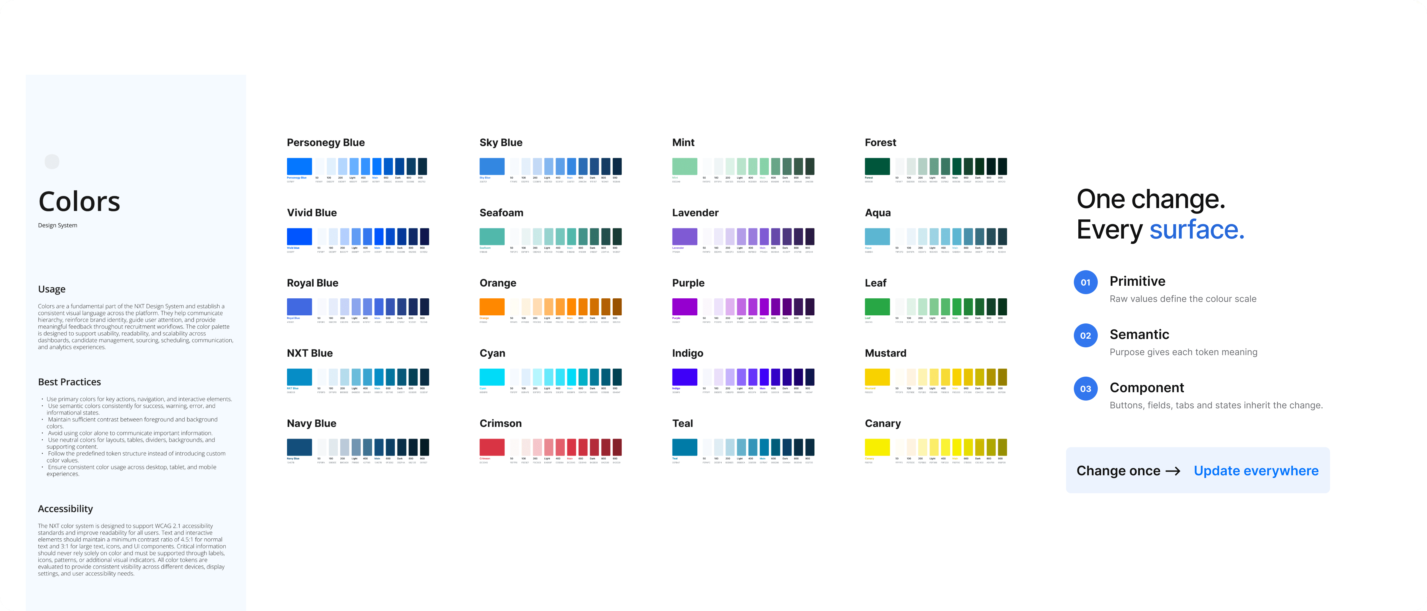
Layer one, Brand tokens
Raw source-of-truth values that define the visual language: complete colour scales, every step from 50 to 900 with Light, Main and Dark named inside them. These are never applied to a screen. They exist to be referenced.
- Color/Blue/Main
- #007BFF
- Color/Blue/600
- #0062CC
- Color/Blue/900
- #002752
- Color/Sky Blue/Main
- #3387E1
- Color/Neutral/900
- #1A1A1A
Every palette carries a full scale rather than the two or three steps a screen happens to need today, because states and accessibility both need the room. The rule: update colour only at this layer, and never reference a raw hex anywhere else.

Layer two, Alias tokens
The semantic meaning layer, and the one that changes how a team talks. Aliases map brand colours to product meaning, Primary, Secondary, Success, Information, Warning, Error, so the visual palette can evolve without touching a single component implementation.
- Palette/Primary/Main
- Color/Blue/Main
- Palette/Secondary/Main
- Color/Sky Blue/Main
- Palette/Success/Main
- Color/Leaf/Main
- Palette/Error/Main
- Color/Crimson/Main
This is where I stopped having a colour palette and started having a language. A button no longer asks for blue. It asks for primary. Primary covers buttons, links, active navigation and interactive states; Success positive status; Warning caution and pending; Error validation and failures. Those definitions are written down, because a semantic layer only works if everyone agrees what the words mean.

Layer three, Mapped tokens
The implementation layer, and the only one components are allowed to consume. Mapped tokens assign semantic colour to a specific UI purpose, grouped as Text, Surface, Border and Icon, and nothing in this layer holds a value. Every row points one layer down.
- Text/Headings
- Palette/Neutral/900
- Text/Action
- Palette/Primary/Main
- Text/Disabled
- Palette/Neutral/400
- Surface/Page
- Palette/Neutral/White
- Surface/Action-Hover
- Palette/Primary/600
- Surface/Error
- Palette/Error/100
- Border/Focus
- Palette/Primary/Main
A component never asks for a colour. It asks for a job: this text is a heading, this surface is a card, this border has focus. Thirty-six decisions answer for every component in a nine-module platform, and because every state is mapped here rather than decided per screen, they stay consistent without anyone maintaining them.

The responsive layer
Running alongside the colour chain is a separate collection for typography, spacing, sizing and layout behaviour across every supported breakpoint, so scale is centralised in the same way colour is, rather than being overridden screen by screen.
- Heading/H1
- 56
- Heading/H2
- 48
- Heading/H3
- 34
- Heading/H4
- 24
- Subtitle/1
- 18
- Body/1
- 16
- Body/2
- 14
- Button/Large
- 14
Font size, line height, letter spacing and spacing each get their own groups inside the collection, which is what keeps vertical rhythm consistent across dashboards, tables, profiles, forms and analytics, screens that otherwise have little in common.
Three layers for colour and one for scale sounds like bureaucracy, and I remember worrying it was over-engineered for a team of our size. It wasn't. It is the only reason the rebrand later took what it took instead of consuming a quarter.

COMPONENTS
A component is a matrix, not a picture
If I could specify the most-used control completely, everything else could follow the same method. So I took the button apart, three variants, three sizes, six semantic purposes, five interaction states, and an optional icon at the start, the end, both or neither.
I never drew those combinations, and that's the point. I defined rules capable of answering hundreds of intersections, which changed the team's question from "what should this button look like here?" to "which configuration fits this action?" The same method then ran through inputs, date pickers, chips, tabs, navigation, modals, drawers, tooltips and empty states.

The table was the one that mattered
The table took more of my time than anything else, because recruiting in practice is mostly scanning. It had to carry selection, sorting, filtering, pagination, row and bulk actions, status, variable content length, loading and empty states, and column priority that changed with the screen. So I made it a shared structure each module could bend, not one universal fixed component.
I also wrote down what happens when content runs long, data is missing, a request fails, or someone lacks permission. I wanted edge cases to be part of the definition, not discoveries during implementation.

ACCESSIBILITY
Written into the component, not reviewed at the end
Recruiters live inside this product all day. Making it visually simpler at the cost of information they need would be a failure dressed up as taste, so accessibility became part of the component definition rather than a review at the end: fix contrast inside one component and you've fixed it everywhere it appears.
WCAG 2.1 AA guidance shaped the rules, contrast for text, controls, borders and status; predictable focus order with visible focus. And status was never carried by colour alone: a label, an icon or a position always reinforced it, because someone scanning a pipeline shouldn't have to decode a hue.

IMPLEMENTATION
I designed against the thing that actually shipped
The frontend was React and Material UI. I could have built a self-contained Figma library and handed it over and engineering would have spent months translating my fictional component universe into the real one.
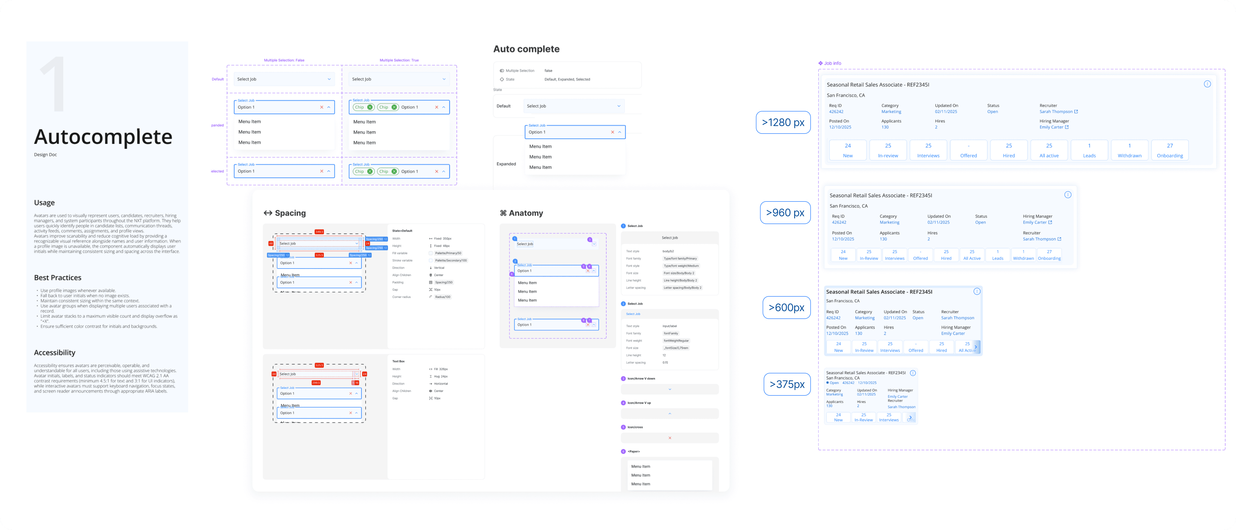
So I aligned the component model with Material UI primitives instead. It was our implementation foundation, not our product identity: I customised hierarchy, visual language, states and density for NXT's workflows, but kept the underlying vocabulary implementable. That meant design and engineering named the same thing the same way and our reviews stopped being about whether a screen looked right and started being about whether a state or an edge case was missing, and then solving it once.
Every reusable pattern got documented: anatomy, spacing, states, token bindings, responsive rules, accessibility, developer notes, constraints. We were spread across time zones, and I wanted the system to keep working when I wasn't awake to explain it.
THE TEST
Then the company rebranded
This is the part where I found out whether the architecture was any good.
NXT became Personegy, new brand foundations, a refreshed identity, and a second version of the product to carry it. If we had kept applying colour directly to components, this would have meant opening 120+ screens by hand with the near-certainty of missing some.
Instead the change landed on the brand layer. The semantic aliases above it kept their names and their meanings. Every component still asked for Palette/Primary/Main and still got the right answer back. One layer changed, and everything above it followed.
You can still see both generations in the file, the NXT collections sitting alongside the Personegy ones, 173 and 154 variables of the first brand beside 212, 212, 36 and 69 of the second.
Version 2 also brought refined collections, improved variants and breakpoint-specific behaviour all still aligned with Material UI and React. The system absorbed the change instead of being rebuilt, and that's the outcome I'm proudest of here.

OUTCOME
What it ended up supporting
- 6 collections
- Brand, Alias, Mapped and Responsive, across two brand generations
- 856 variables
- 529 in the current Personegy system, 327 carried from NXT V1
- 120+ screens
- Across nine modules, from 375px to 1920px
- 2 brands
- NXT's early product language, then Personegy V2
The counts were never the interesting part. What changed was how we worked. Engineers knew what a state was supposed to do before they built it. And recruiters met the same interaction logic wherever they went, the only version of this they ever notice.
What I'd tell the next designer
The order we worked in is the thing I'd defend hardest, and it's the thing most likely to be questioned. A design system separated from the product that gives it meaning is just a library of opinions.
The product showed me which decisions kept repeating. Repetition made them patterns. Stability made patterns components. Only then did tokens, variables and documentation have anything worth binding together.
That isn't an argument for putting systems off. If you're joining a product that already exists, start from the system, you have the evidence. At genuine zero you don't, and building rules before you have it is how you end up maintaining decisions nobody needed.
And the system never removed the complexity. Recruiting at volume is complex, and pretending otherwise would have made the product worse. What I did was organise it into decisions a distributed team could understand, reuse and maintain.
The product gave the design system its purpose.
The design system gave the product room to grow.