From scattered recruiting workflows to one connected hiring platform
As the sole product designer, I spent 18 months turning fragmented recruiting work into Personegy: a responsive, nine-module platform built from business requirements to production.
NXT wasn’t building another job board.
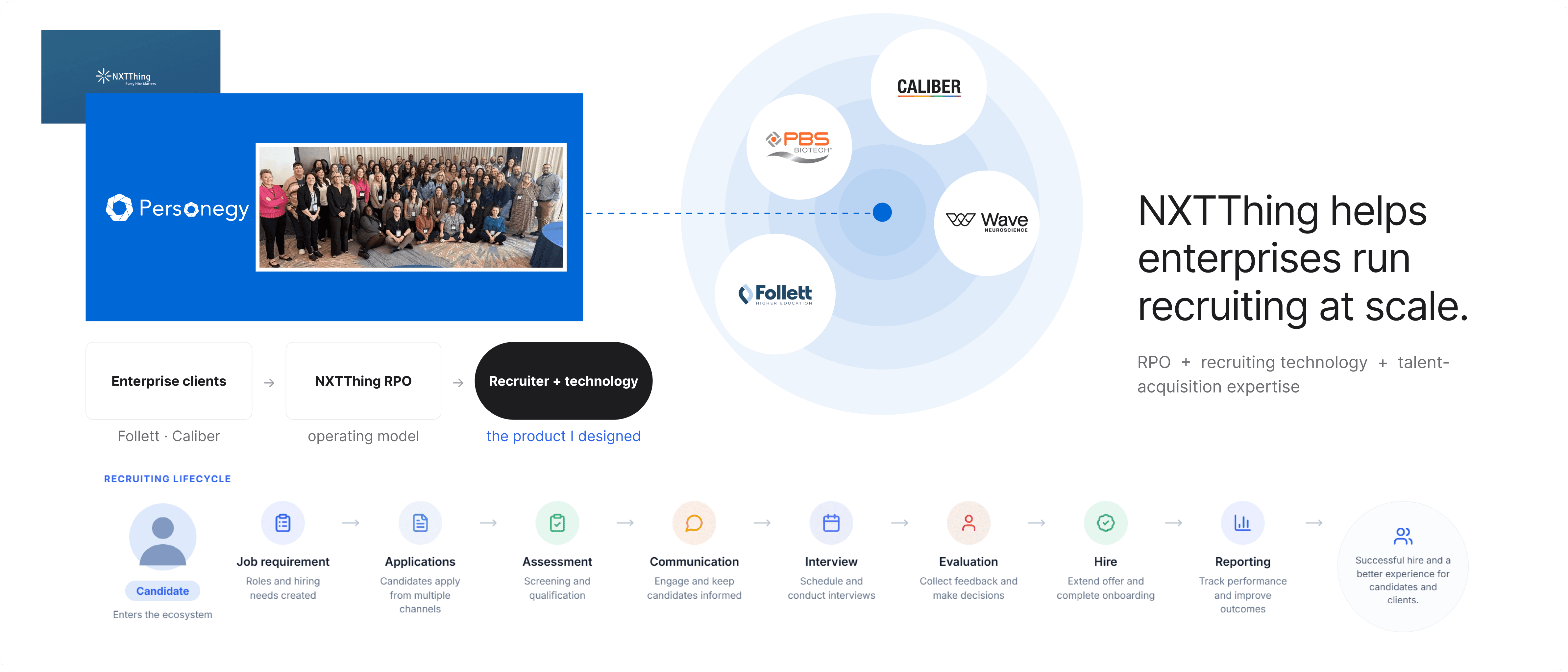
NXTThing RPO runs recruiting as an extension of its clients’ teams. Its recruiters source, screen, coordinate interviews, talk to hiring managers and support onboarding, often across several client programs on the same day.
A conventional ATS stores candidates and requisitions. NXT needed an operating environment that could carry many clients’ rules and still feel like one coherent place to work. I joined as the only designer, with requirements but no product model.
Product Architecture
Modelling how jobs, candidates, messages and interviews connect, and where client context changes the experience.
Interaction Design
Nine modules and 120+ responsive screens, from 375px to 1920px, with one shared language.
Explainable AI
Candidate matching that shows its reasoning and leaves the hiring decision with recruiters.
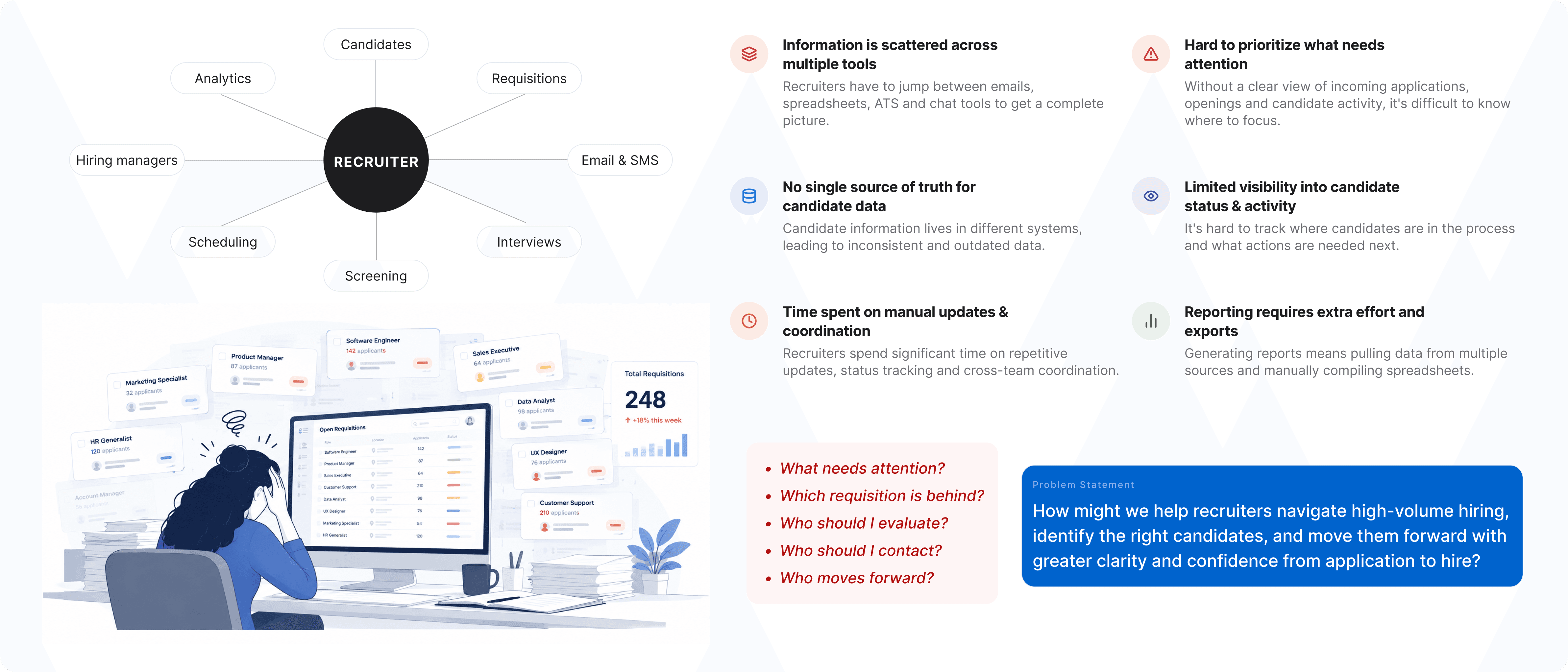
No single task was broken. The experience was fragmented.
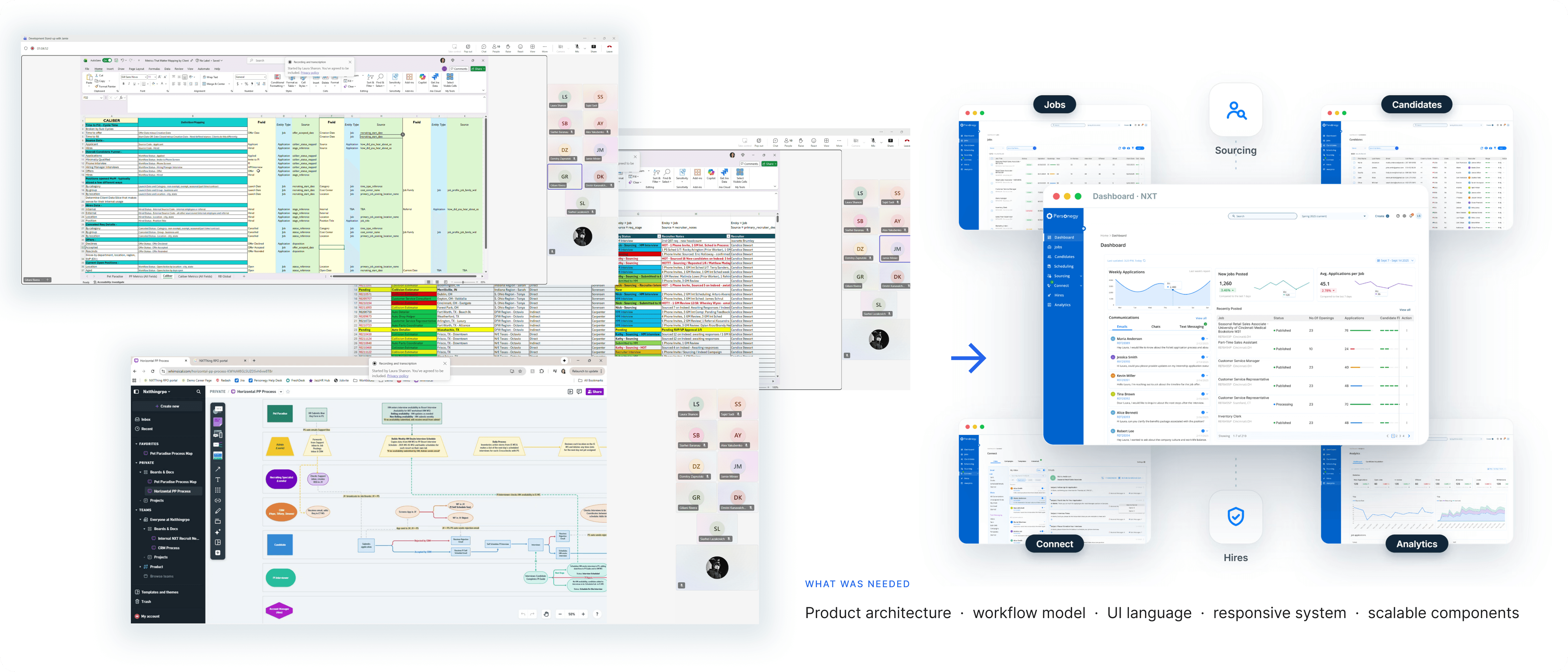
Candidate records, conversations, interviews and reporting lived in separate tools. Recruiters had to rebuild the story before every decision, and at pipeline scale that friction multiplied.
Hundreds of active candidates competing for attention
Routine tasks spread across tools and spreadsheets
Status and recent activity hard to see at a glance
Manual coordination creating delays and avoidable errors
No clear way to know what needed attention first
The reframe“Recruiters weren’t short on information. They were short on time, context and clarity.”
The opportunity was no longer a better database. It was a system for attention: one place to see what changed, decide what mattered, and act without reconstructing the story first.
Nine modules built around one recruiting lifecycle.
Instead of nine tools in one shell, Personegy is organised around the path every hire takes. Wherever a recruiter starts, the job, the client and the candidate’s story travel with them.
Job→Application→Assessment→Communication→Interview→Evaluation→Hire
Context stops resetting
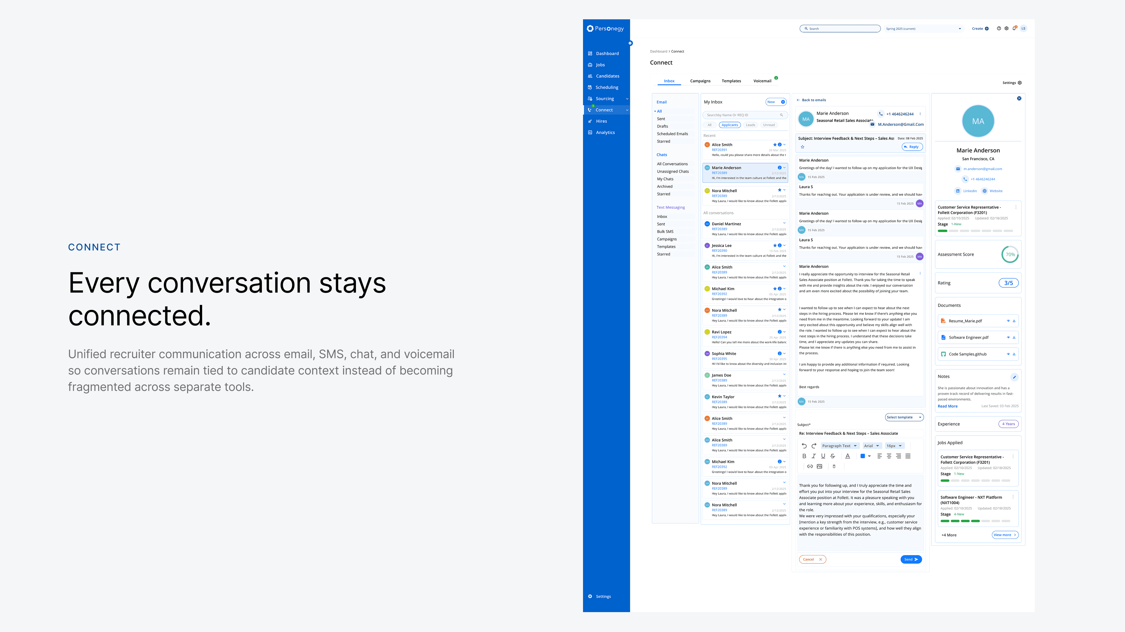
Client, job and candidate context carries across modules instead of being rebuilt on every screen.
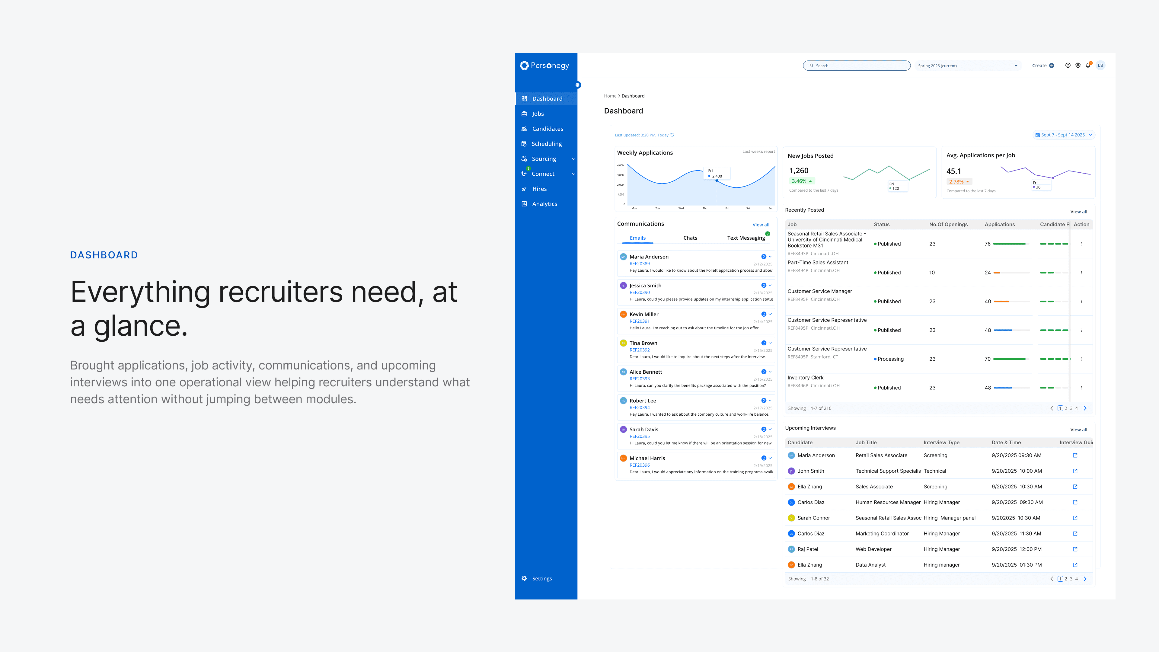
The day starts with priorities
The dashboard surfaces what needs action now, not a summary of what already happened.
AI explains, people decide
Match scores arrive with their evidence, and the hiring decision stays with the recruiter.
Five moments that carry a recruiter’s day.
What it feels like to work in Personegy, before getting into how it was designed.
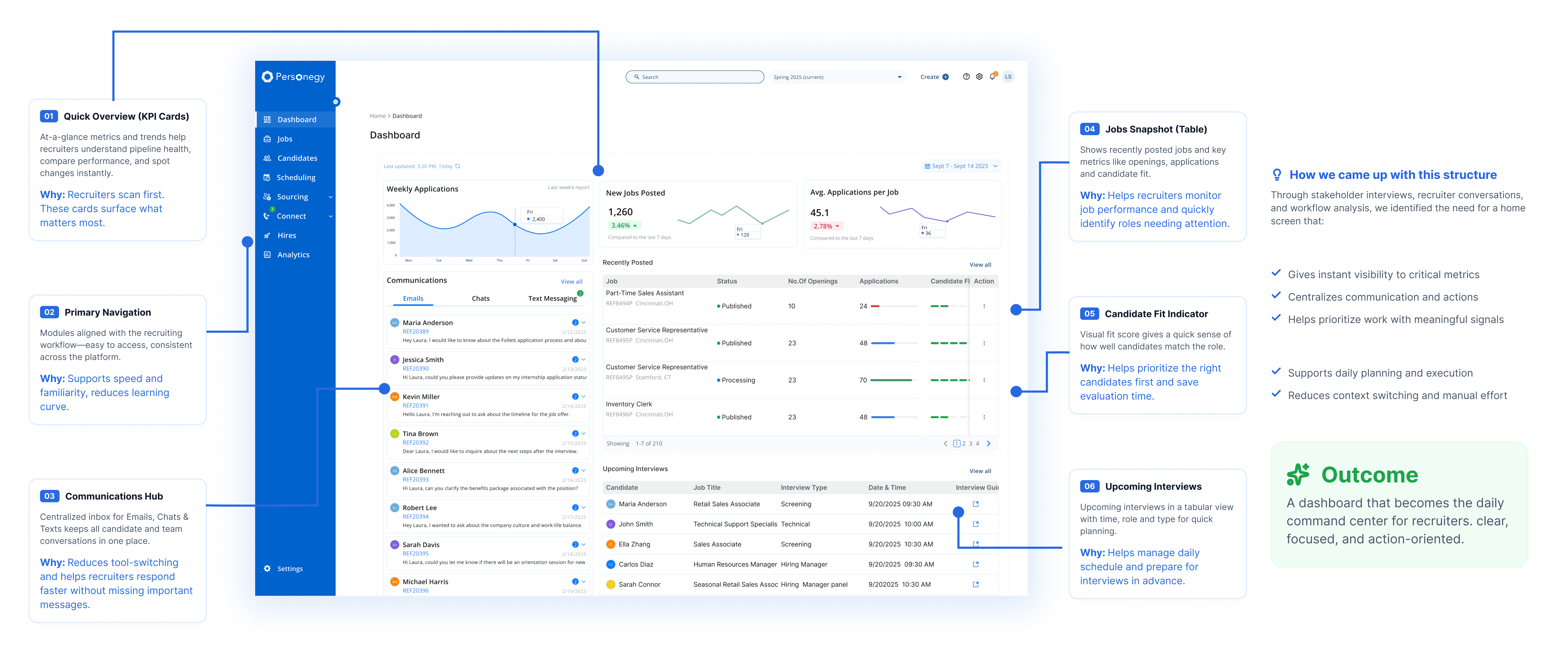
Start the day from the dashboard
Awareness (activity across jobs, candidates, messages and interviews) is separated from action (new applications, candidate fit, pending messages, upcoming interviews).
Work inside a requisition
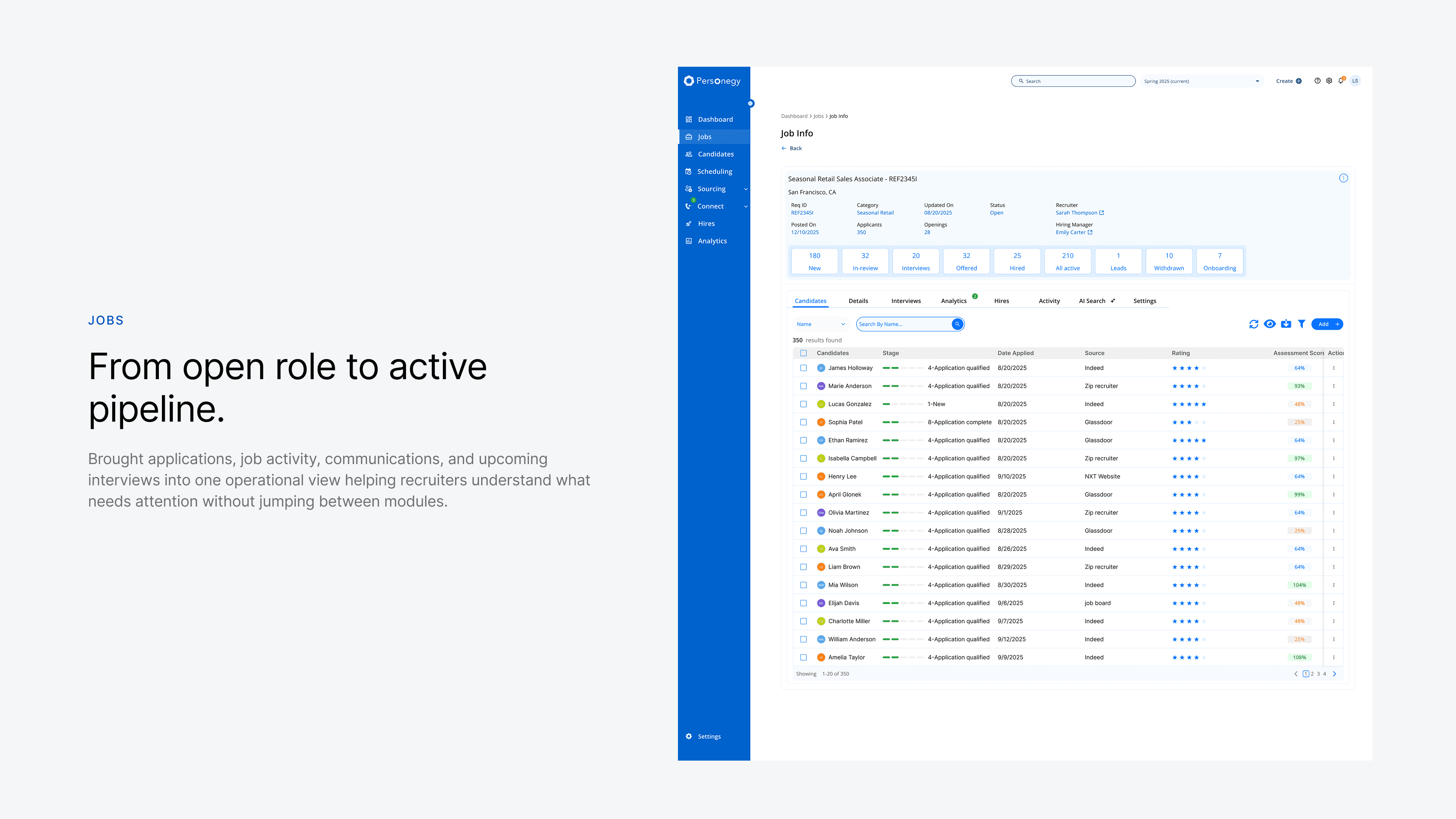
A persistent header keeps the job, client, recruiter, hiring manager, openings and pipeline visible. Stage counters open focused candidate groups, so recruiters never filter their way back.
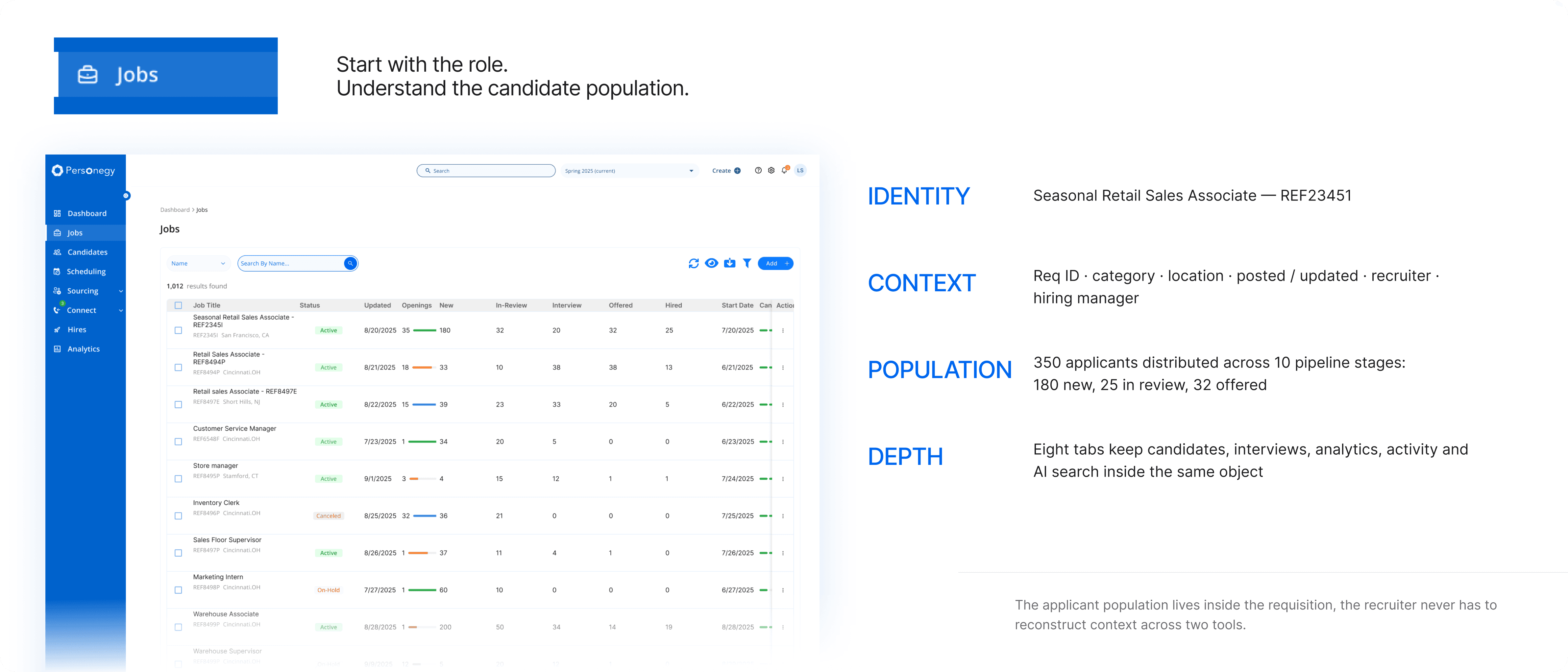
Narrow hundreds of candidates to a few
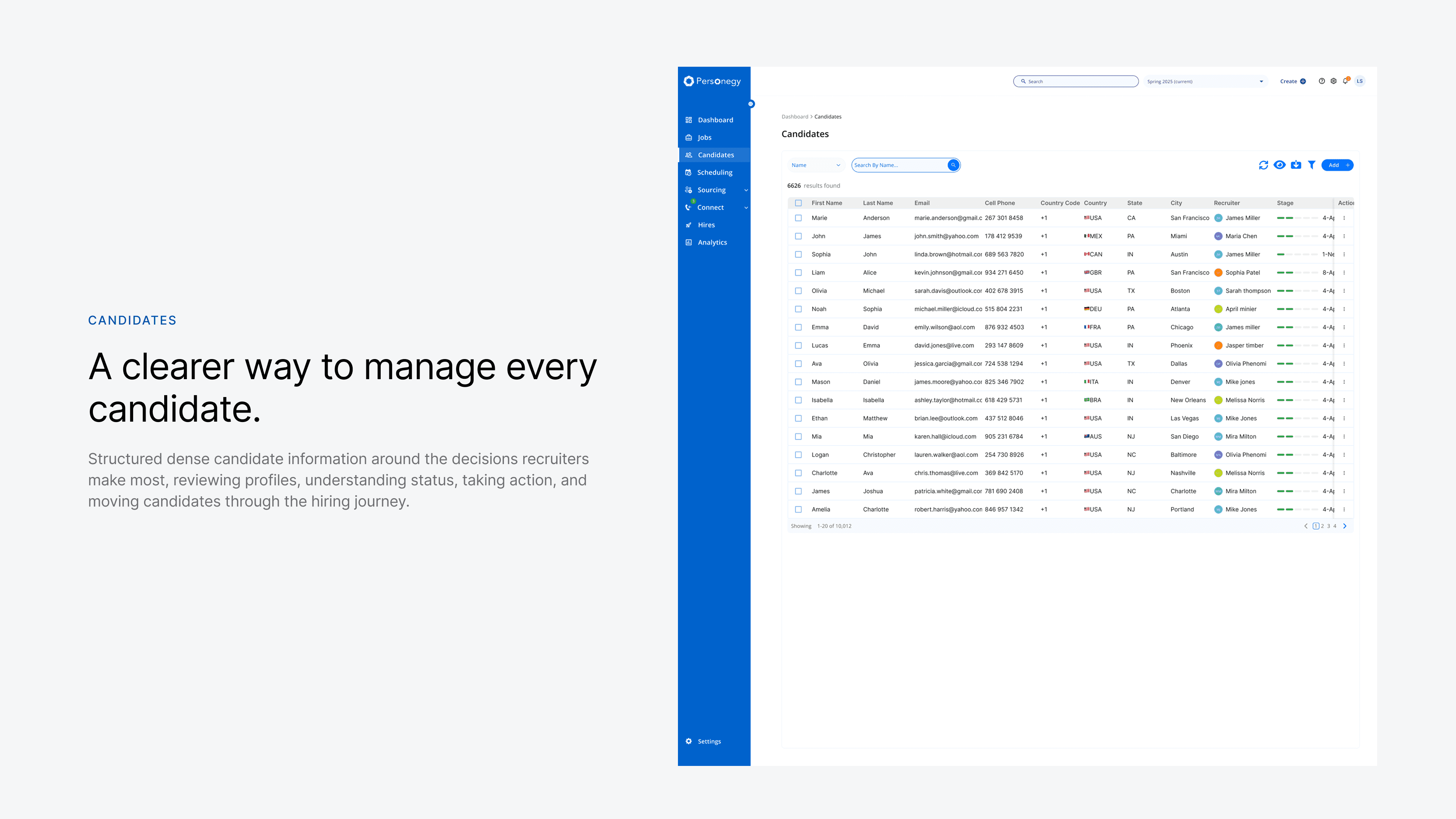
Scanning for who deserves attention and evaluating one person in depth are different modes. Filters stay visible as the record of the question being asked.
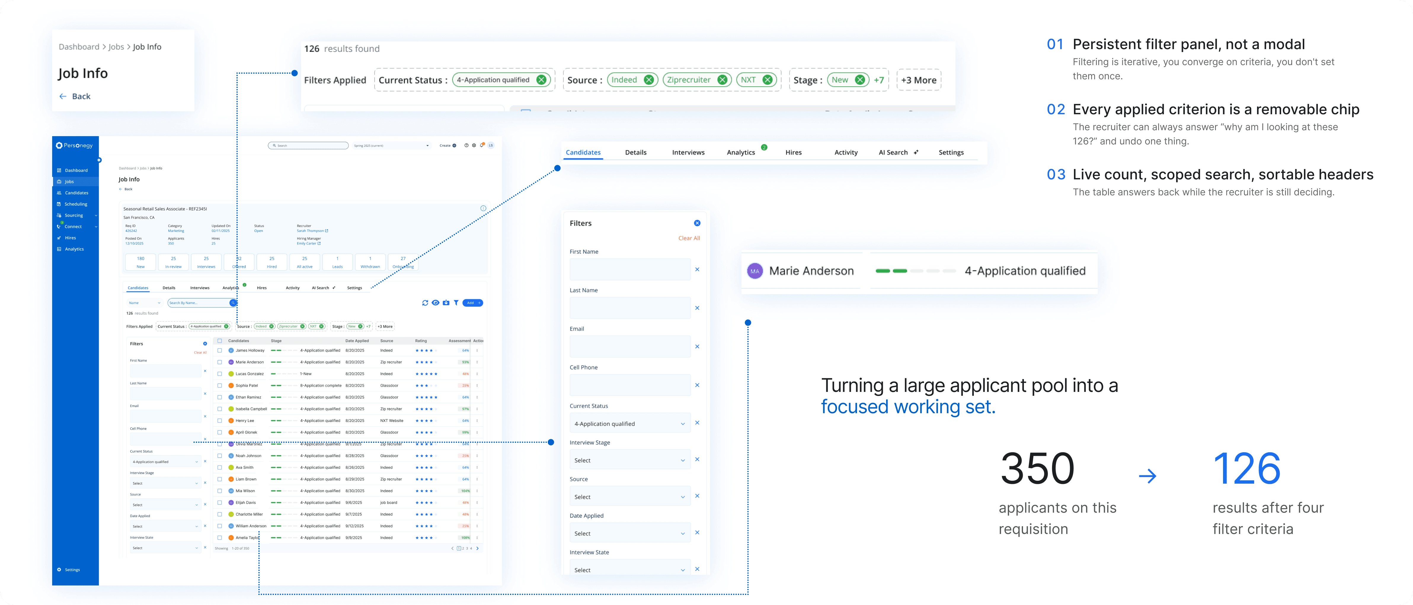
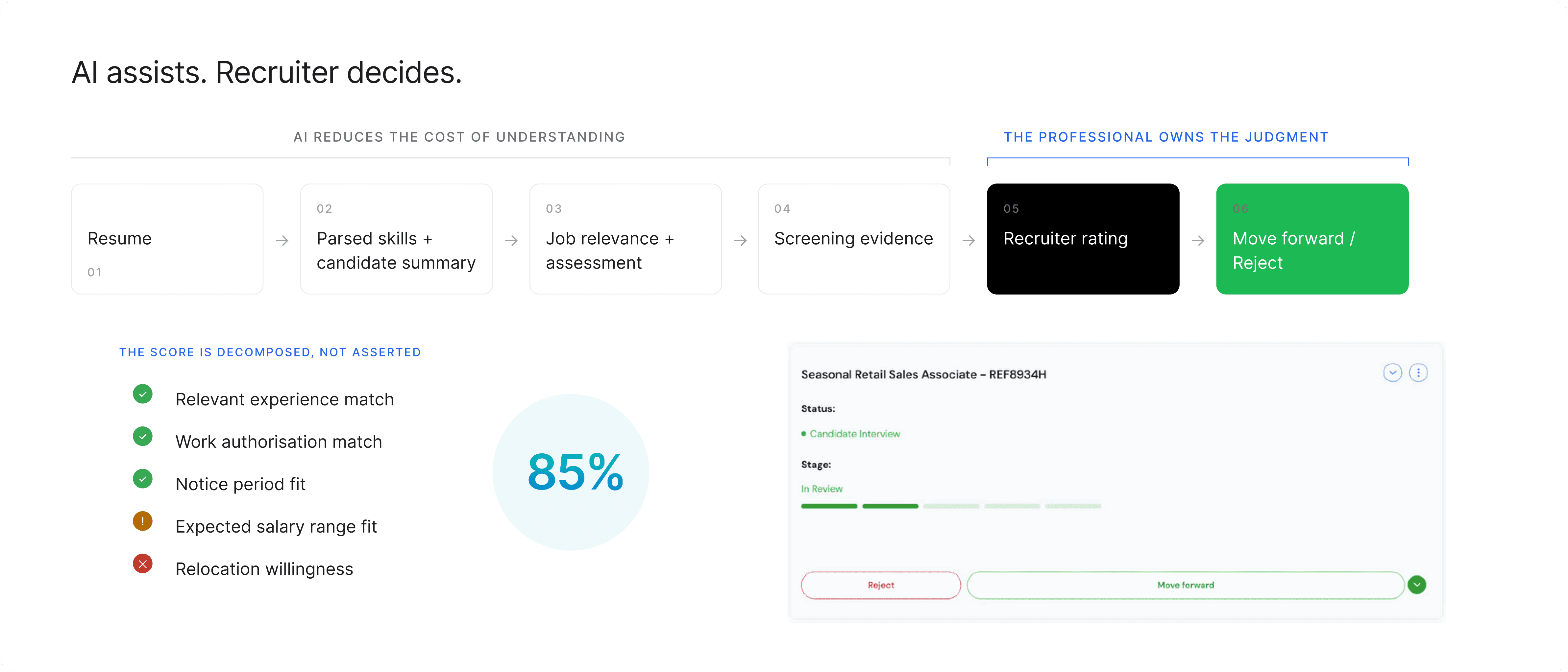
See why a candidate matches
A generated summary, matched and additional skills, and criterion-level explanations. Conflicting evidence is surfaced, and the recruiter makes the call.
Switch client once, everywhere
Client and program selection lives in a persistent utility bar. Switching it rescopes every module at once.
Shipped to production. Publicly unveiled as Personegy in 2025.
Business requirements and workflow models became a production platform used for real recruiting operations: NXTThing’s AI-enabled hiring platform for high-volume recruiting.
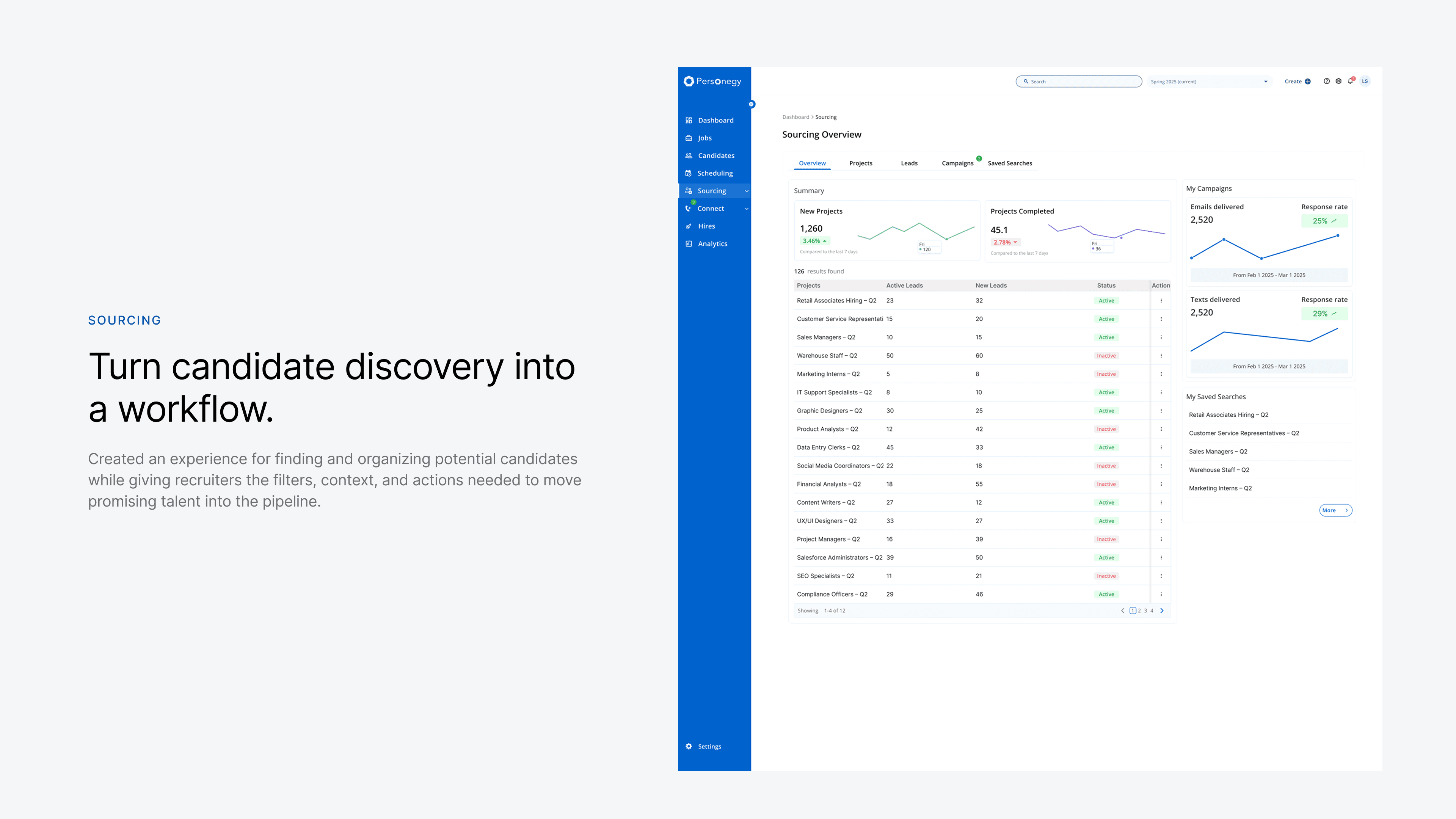
Dashboard, Jobs, Candidates, Connect, Sourcing, Scheduling, Hires, Analytics, Settings
Designed across the full platform
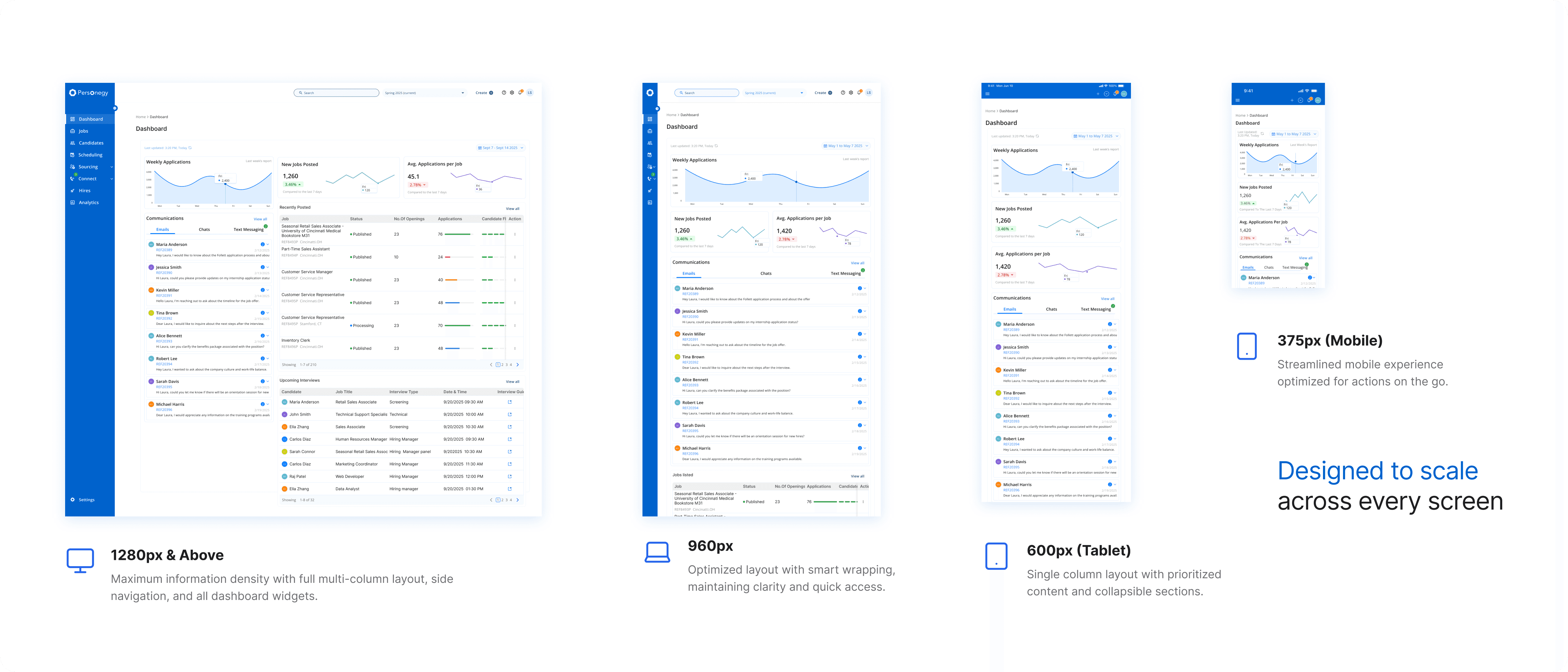
Responsive. Components reprioritize, not just shrink.
Requirements to production
Company outcomes from a 16-person team. The awards recognise the product, not my design work in isolation.
My contribution was the product architecture, the connected workflows, the decision-focused dashboards and evaluation patterns, the explainable-AI approach, and the shared interaction language underneath.
- Before
- Rebuild the candidate’s story in every tool
- After
- Context travels with the recruiter across nine modules
- Before
- Filter every module separately for each client
- After
- Switch client once, and the platform rescopes
- Before
- No clear place to start the day
- After
- A dashboard split into awareness and action
So, how did we get here?
From what shipped, to why it was designed this way.
The brief changed when I watched recruiters work.
Interviews explained the challenges recruiters faced. Watching the work explained why they existed: information lived across systems, data was copied by hand, and recruiters carried context from one screen to the next.
Stakeholder conversations
The business, client commitments, and the workflow gaps people already knew about.
Recruiter interviews
Recruiters across different clients and hiring volumes.
Contextual inquiry
Watching real work happen across tools and spreadsheets.
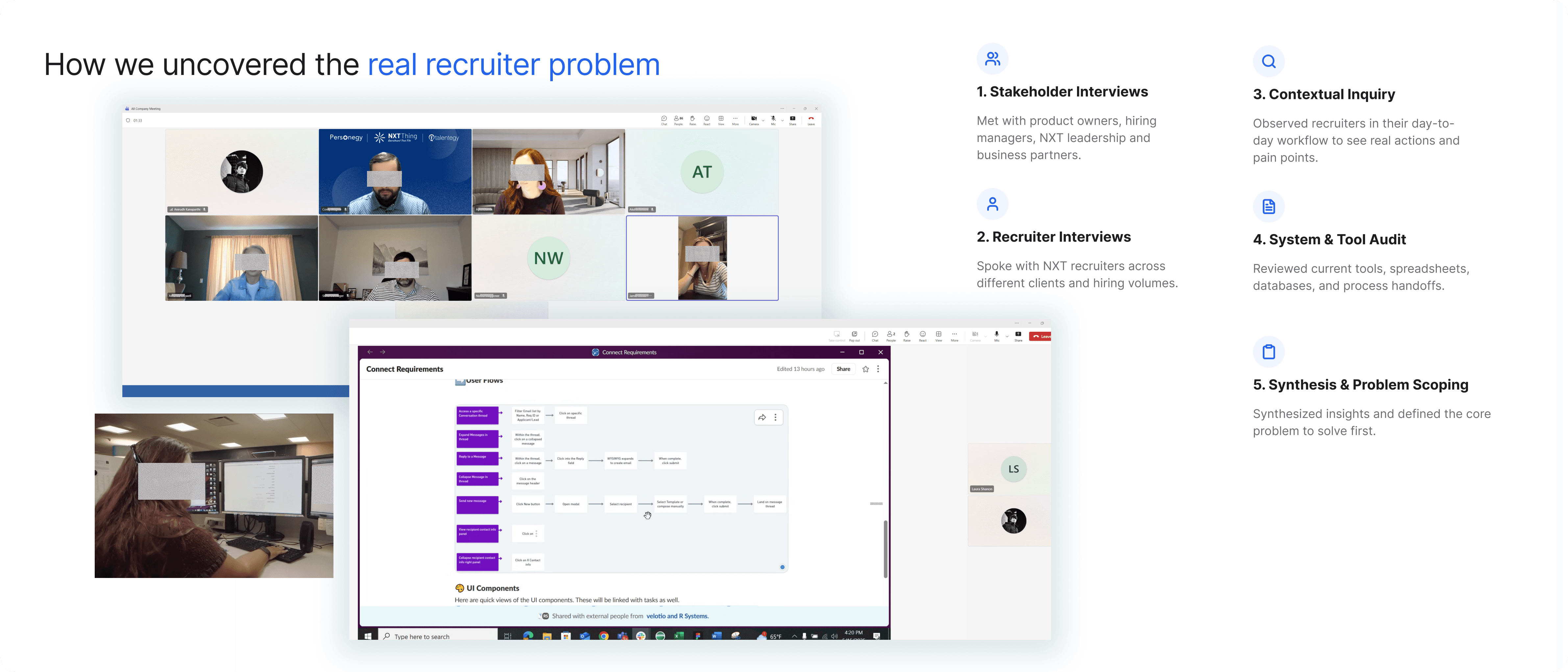
Three insights that shaped the product
Every piece of information existed, in a different system.
Recruiters rebuilt each candidate’s story before every decision.
Recruiters move between client programs on the same day.
Filtering every module per client would multiply effort and mistakes.
The hardest question was what deserved attention first.
Hundreds of active candidates competed for limited time.
Five questions that shaped the product.
Each started as an open question with more than one reasonable answer.
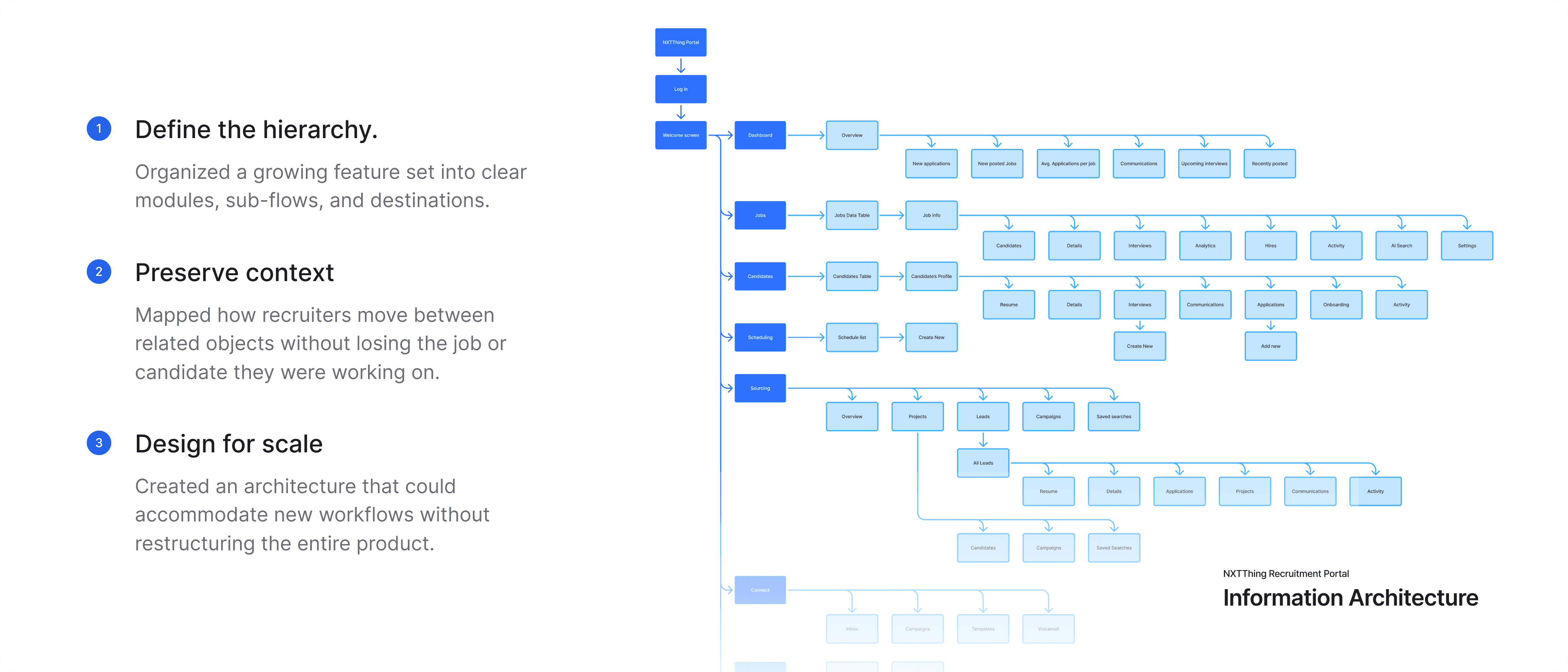
How do nine modules share context instead of behaving like nine products?
- Context
- Recruiters move continuously between jobs, candidates, assessments, messages, interviews and analytics. Development couldn’t pause while the model was worked out.
- Alternative
- Polish the screens implied by the requirements.
- Decision
- Design the connections first, around four rules:
- 01
Client context belongs at the platform level
Switching client or program updates the entire experience.
- 02
Candidates need two entry points
From the global database or a job’s pool, keeping job and client context.
- 03
Communication follows the candidate
Messages stay attached to the person and their hiring journey.
- 04
Analytics reads across the lifecycle
Jobs, candidates, communication, interviews and hires connect.
Top navigation, a permanent sidebar, or an expandable rail?
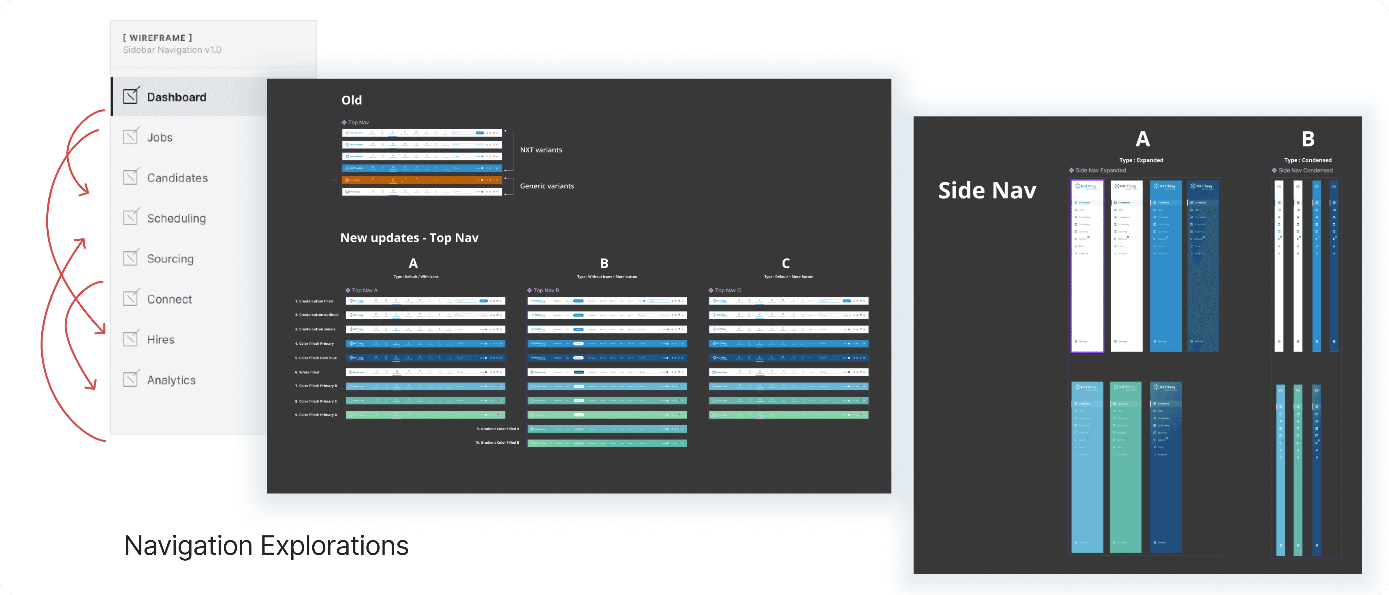
The requirements defined nine modules, but not how recruiters should move between them.
Top navigation
Looked clean, but became restrictive after four modules.
Permanent sidebar
Improved discoverability, but consumed space needed for dense tables and profiles.
Expandable rail
Every module in reach, space returned to the work. Search, client selection and account live in a persistent utility bar.
- Tradeoff
- Slightly less first-use discoverability, in exchange for more working space every day after. For a product recruiters use all day, an easy decision.
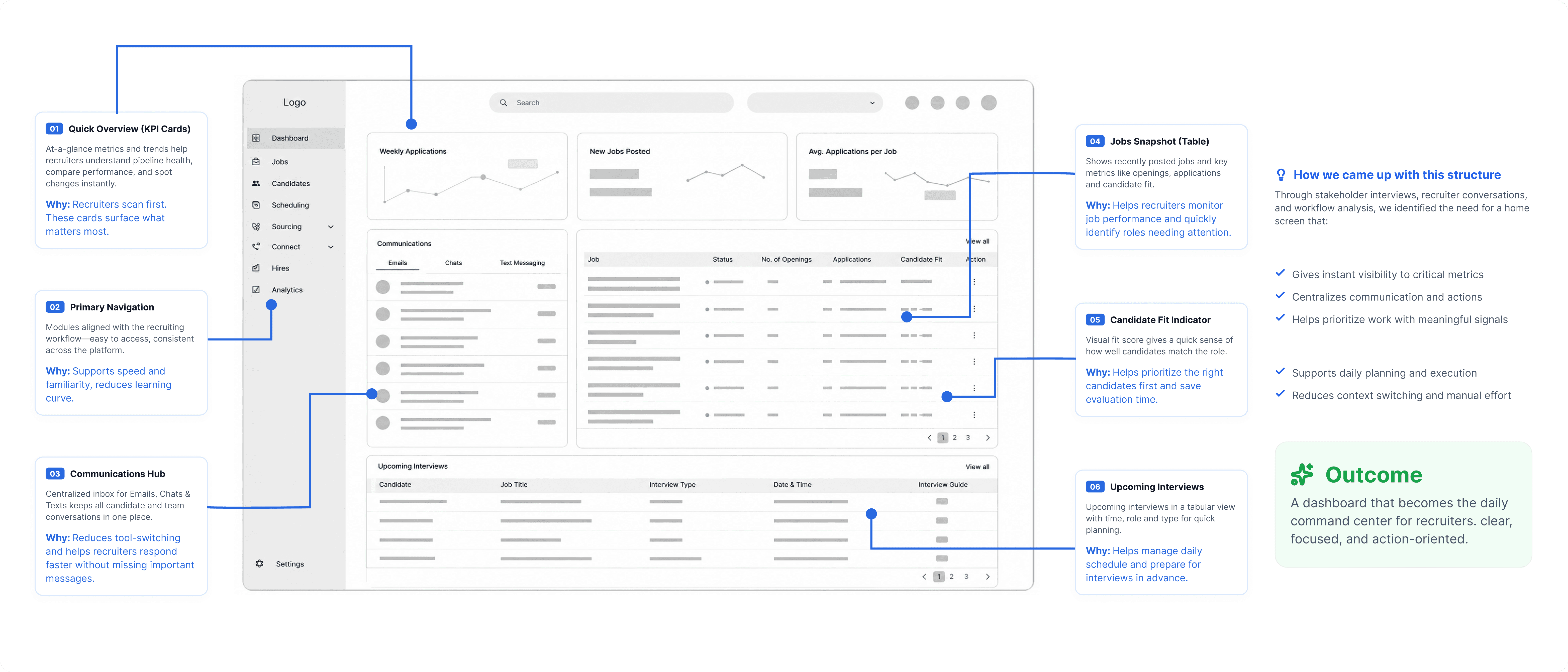
Should the dashboard summarize yesterday, or start today?
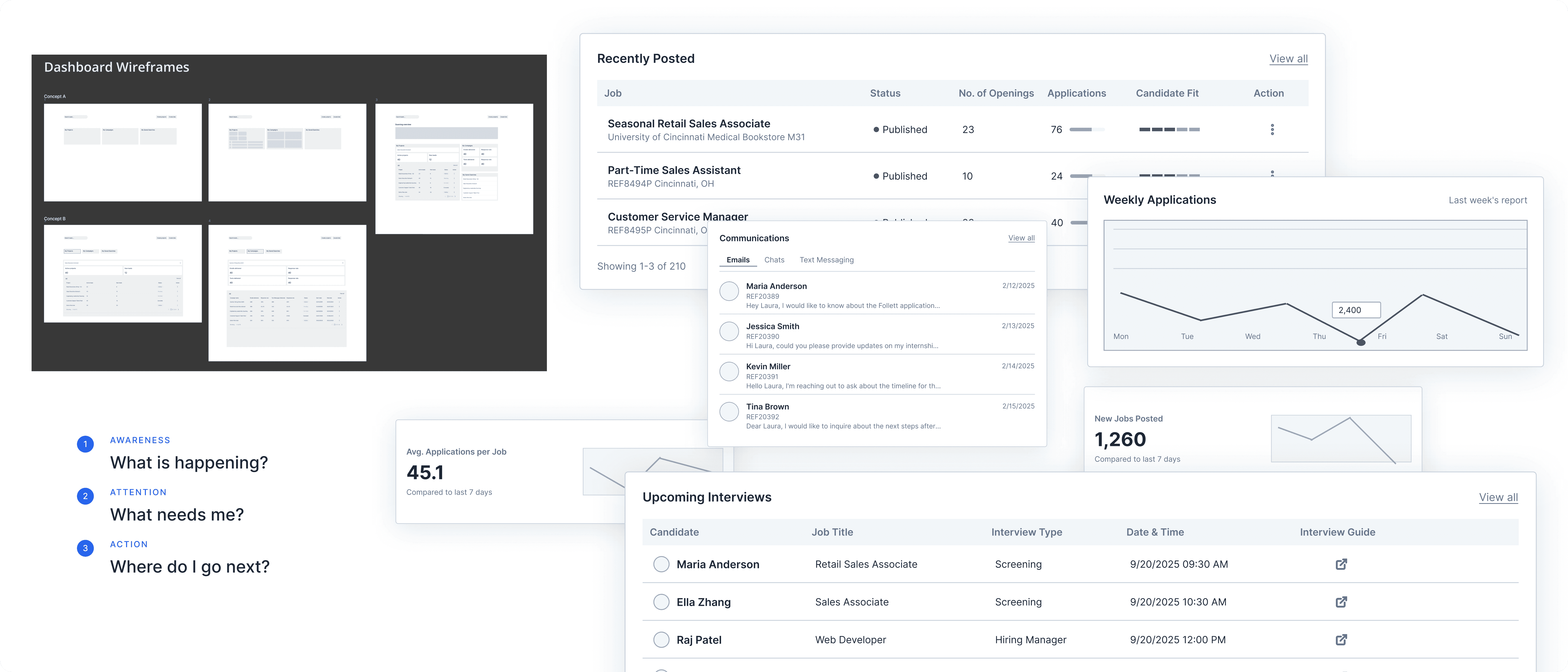
Recruiters didn’t need another summary. They needed a clear place to begin. I set the hierarchy in low-fidelity wireframes, then carried it into production.
Awareness
Activity across jobs, candidates, messages and interviews.
Action
Requisitions, new applications, candidate fit, pending communication and upcoming interviews.
How much should the AI decide?
Candidate matching could save recruiters time. But a score with nothing behind it would trade a time problem for a trust problem. If recruiters couldn’t understand it, they would work around it.
A score on its own
Fast to read, but opaque.
An explained assessment
Summary, matched and additional skills, criterion-level reasons, and conflicting evidence surfaced. Easy to correct when recruiters disagree.
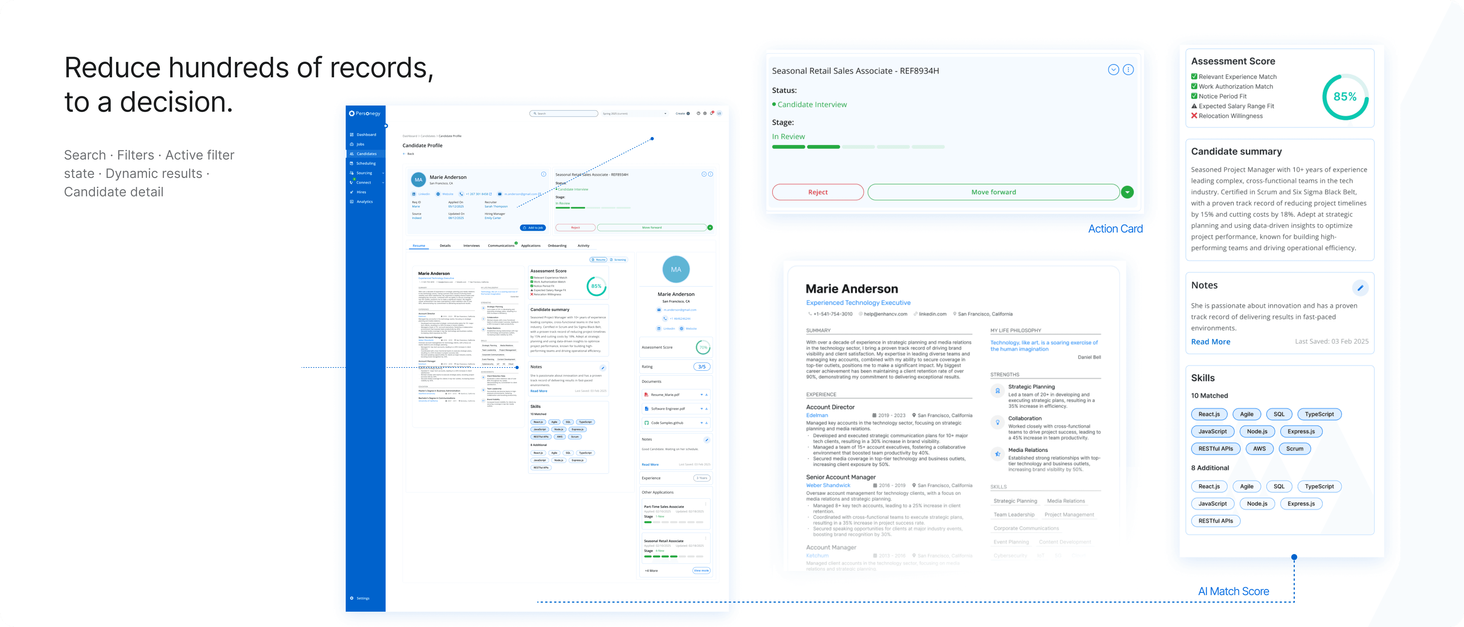
The principle for AI across the product“Show the reasoning, keep the professional in control, and make recovery easy.”
When should a zero-to-one product formalize its design system?
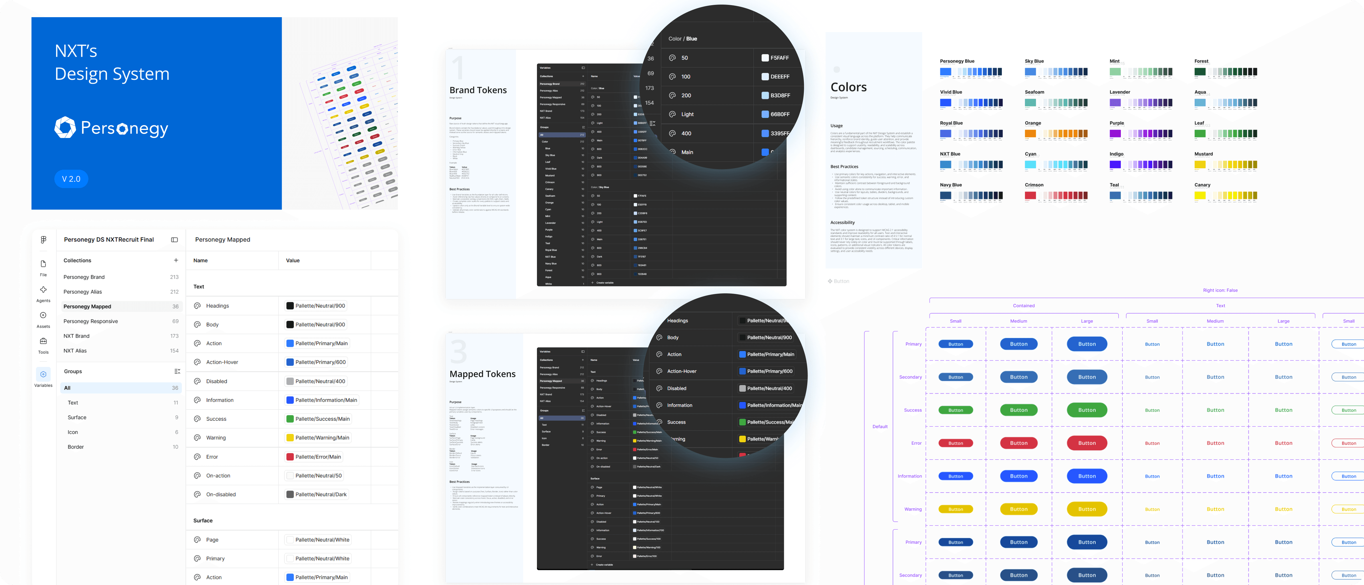
Once the core workflow held, the risk was every new module growing its own dialect. I reused components early, but formalized rules only once recurring behaviors were stable. In a zero-to-one product, the biggest uncertainty is the workflow, not the border radius.
One shell, everywhere
Connect, Sourcing, Scheduling, Hires and Analytics reuse the same shell, tables, filters, chips and states.
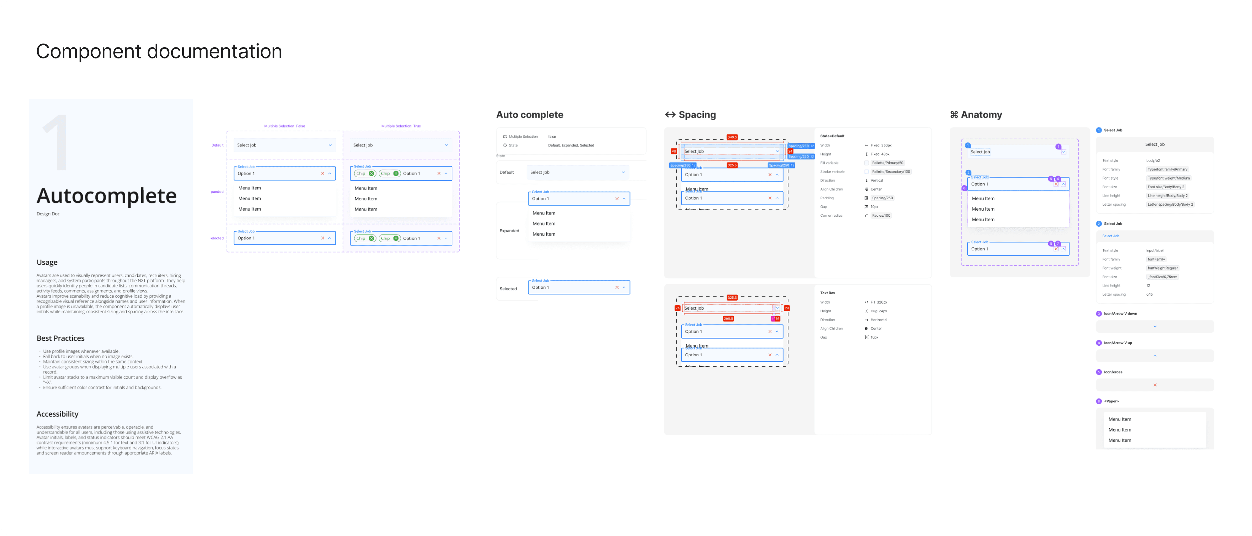
Components as contracts
Docs define usage, accessibility, variants, states, spacing and anatomy.
Responsive by priority
Navigation collapses, tables adapt, filters move into modals, columns stack.
Validated inside a live build.
Architecture, interaction design, components and implementation evolved together rather than in tidy phases, which is closer to how zero-to-one actually goes.
Built with engineering
Engineering constraints changed mechanisms without erasing outcomes.
Tested with recruiters
Recruiters tested the platform with the product and engineering team.
Wireframe to production
The dashboard hierarchy set in wireframes held all the way to production.
The system, working together.
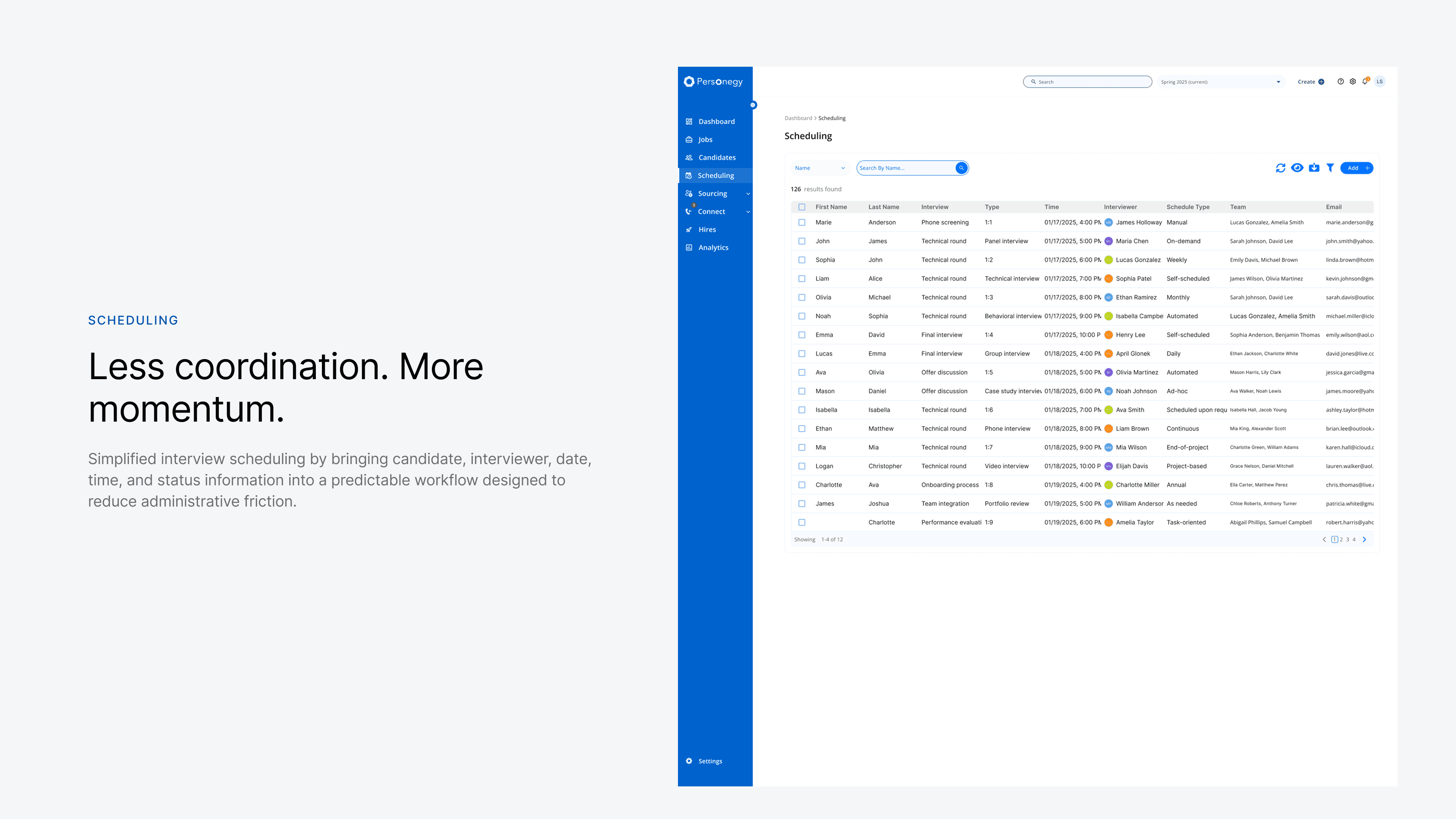
One shell, one interaction language, nine modules. What a recruiter learns in Jobs transfers everywhere else.
What I learned
My biggest contribution wasn’t a screen or a component. It was turning operational knowledge, scattered across people, tools and undocumented client processes, into a product recruiting teams could run on.
- 01
Design through ambiguity, without pretending it’s gone.
Research reshaped the brief, and building revealed which patterns deserved rules.
- 02
Formalize behavior after it stabilizes.
Reusing early and writing rules later kept the system honest about how recruiters worked.
- 03
AI earns trust by clarifying evidence.
It helped most when it reduced reading, and least when it asked professionals to surrender judgment.
The goal was not to hide complexity. It was to make it understandable.