The portal has 80 pages. Accountants use one.
Tax filing in India runs through a government website that buckles every time a deadline arrives. I spent eleven months as the sole designer on the platform accountants use instead.
Twelve million people, one website, one deadline.
Tax compliance in India runs through gst.gov.in, and more than twelve million users depend on it. The problem isn’t that the site exists. It’s that everyone needs it in the same week, so it slows down, and sometimes it goes down.
Financebox wanted to stop routing its clients’ work through that risk: a custom filing platform with fewer errors, simpler workflows, and room to grow across southern India. I led the 0→1 design: research, architecture, the design system and the screens.
Research
Interviews with leadership and six chartered accountants who file for many clients at once.
Architecture
A navigation the accountants named themselves through card sorting.
Design system
Tokens, components and documentation so one designer could keep up with eight engineers.
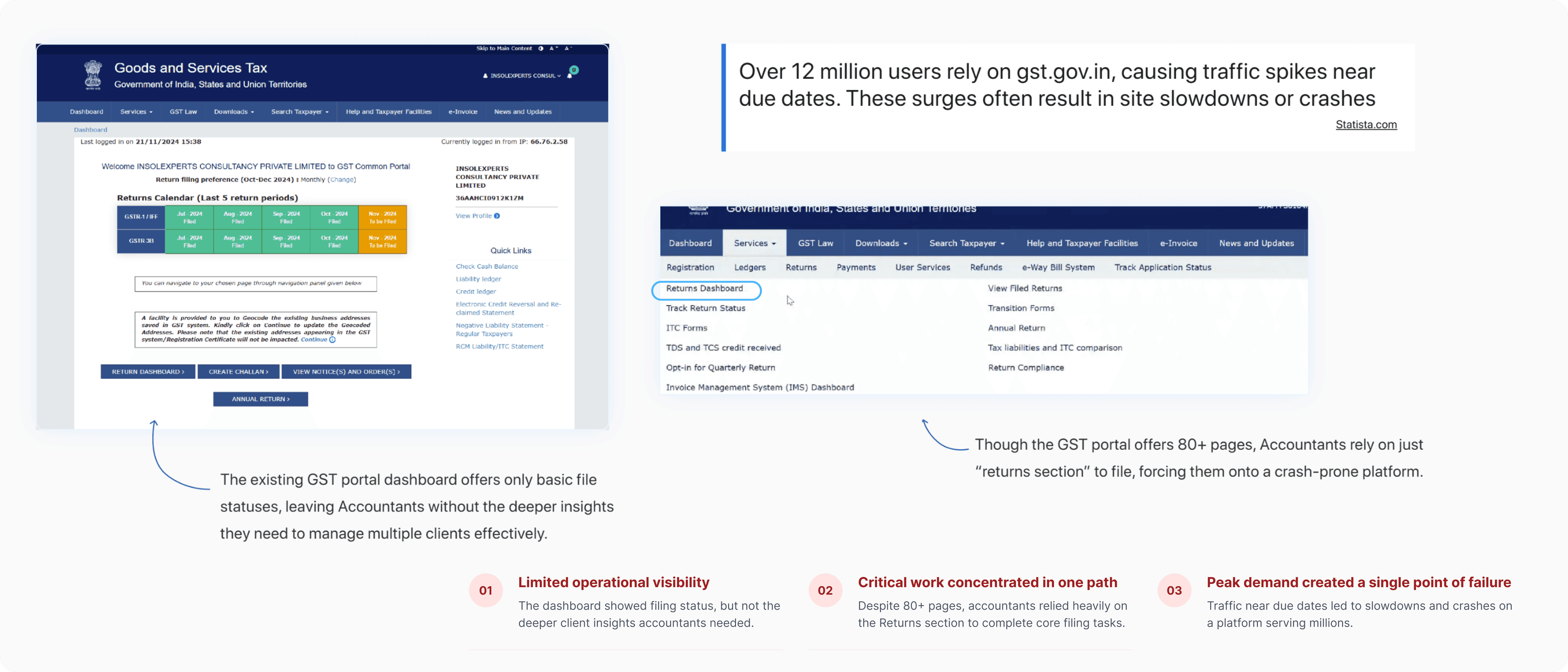
A missed deadline is a penalty with the accountant’s name on it.
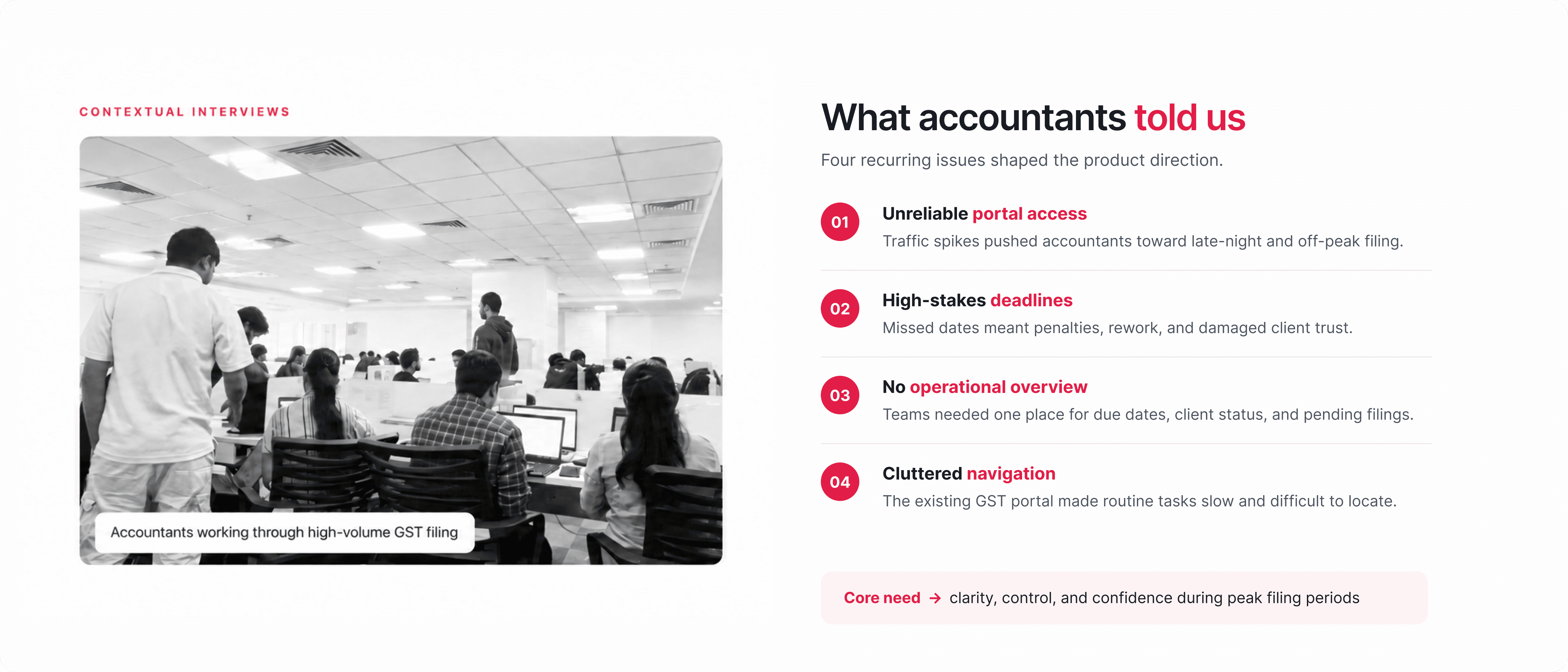
Accountants cope with the portal the only way they can: they file early, or at odd hours, or they wait and hope. When it doesn’t work out, the consequence isn’t an inconvenience. It’s a penalty, and a client who now has a reason to doubt them. Four problems came up in nearly every conversation.
Portal downtime at the exact moment everyone files
Deadlines that cost money and trust when missed
No single view of dues, clients and pending filings
Navigation clutter across more than eighty pages
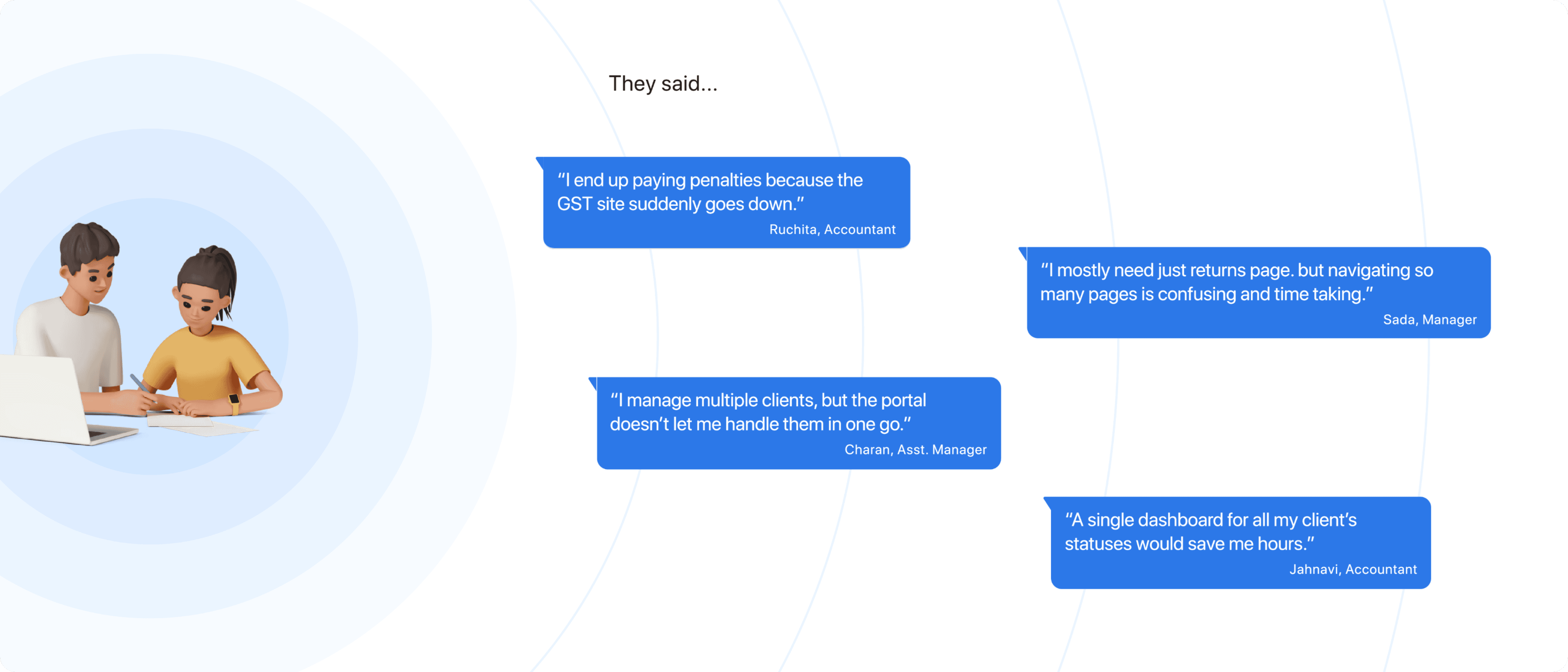
Ruchita, Accountant“I end up paying penalties because the GST site suddenly goes down.”
Better at the one workflow that carries the work.
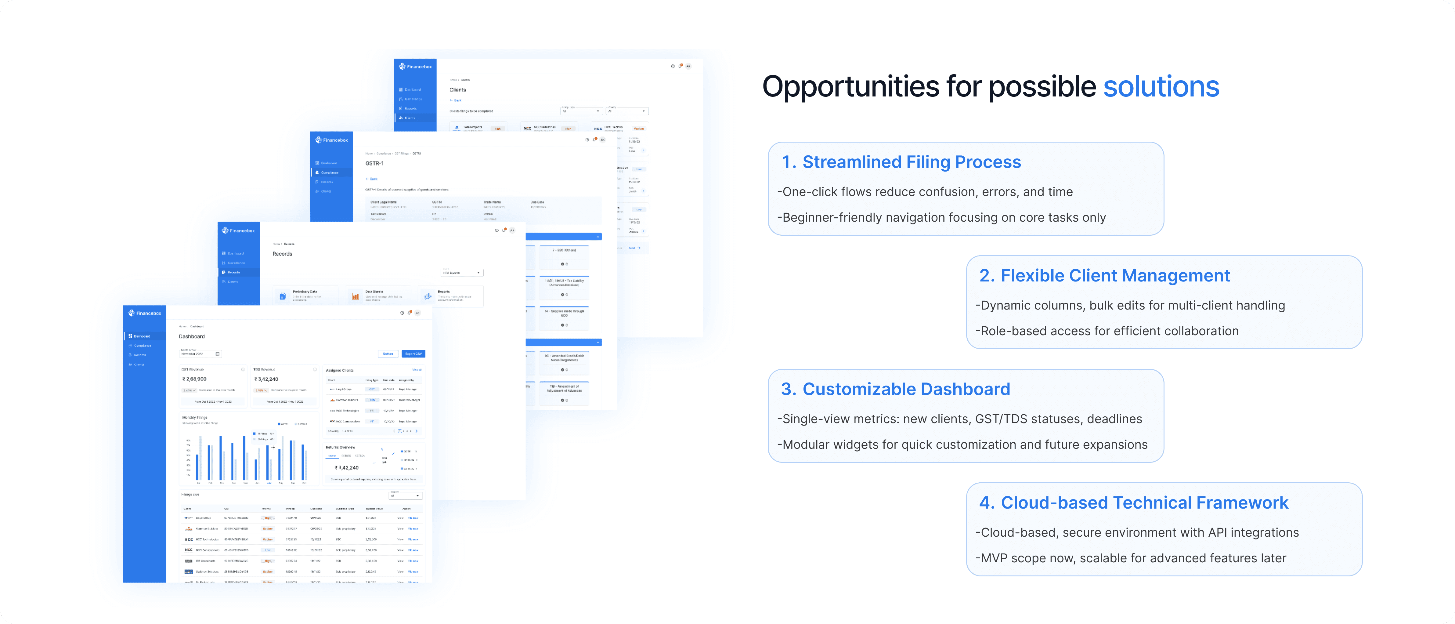
We were never going to beat a government portal on breadth. So Financebox wins on the one workflow that matters, and everything around it: knowing what’s due, seeing every client at once, and getting the record right before filing it.
Dashboard→Clients→Records→Compliance
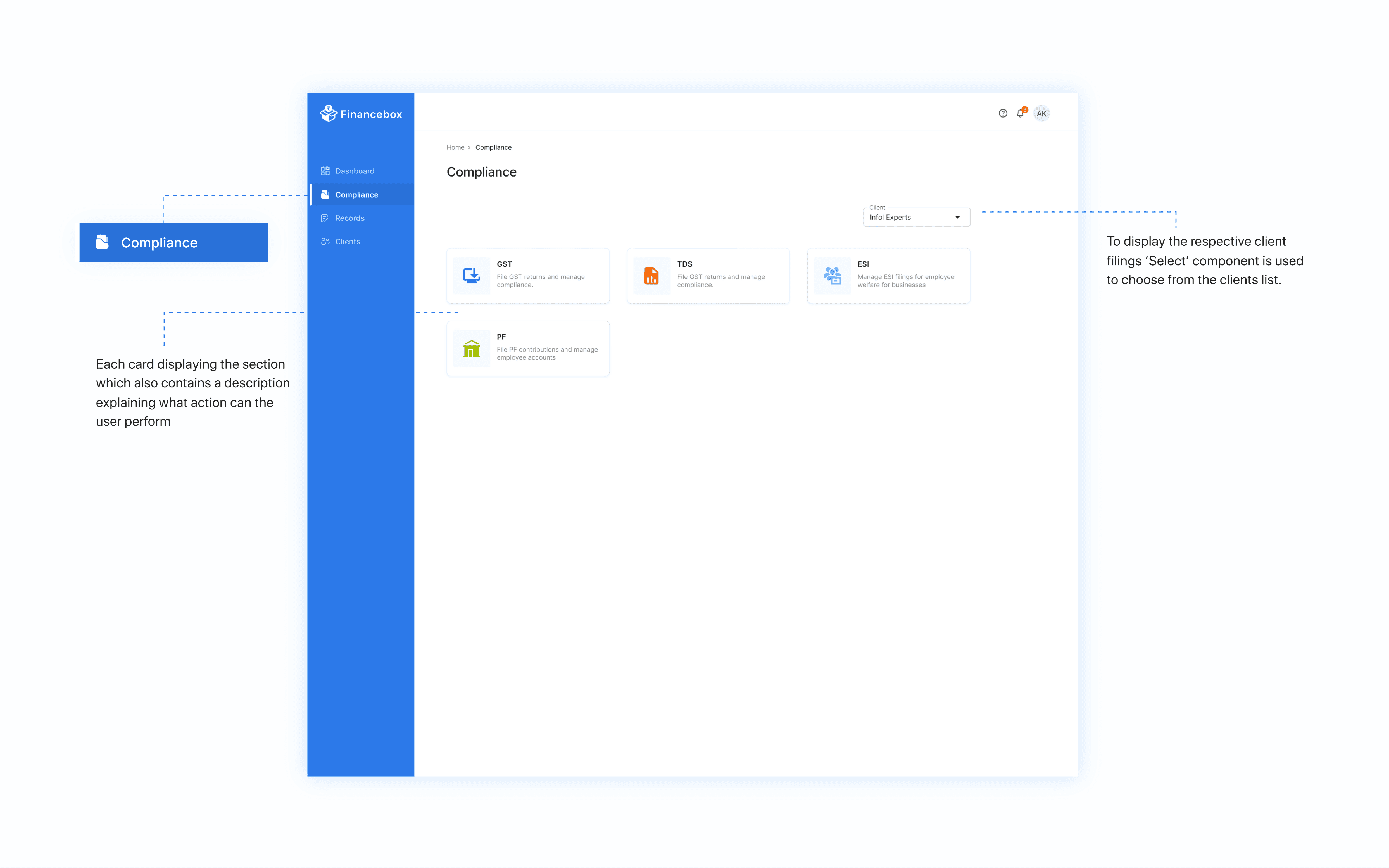
The answer before the question
The dashboard leads with what’s due, whose it is, and what has already gone through.
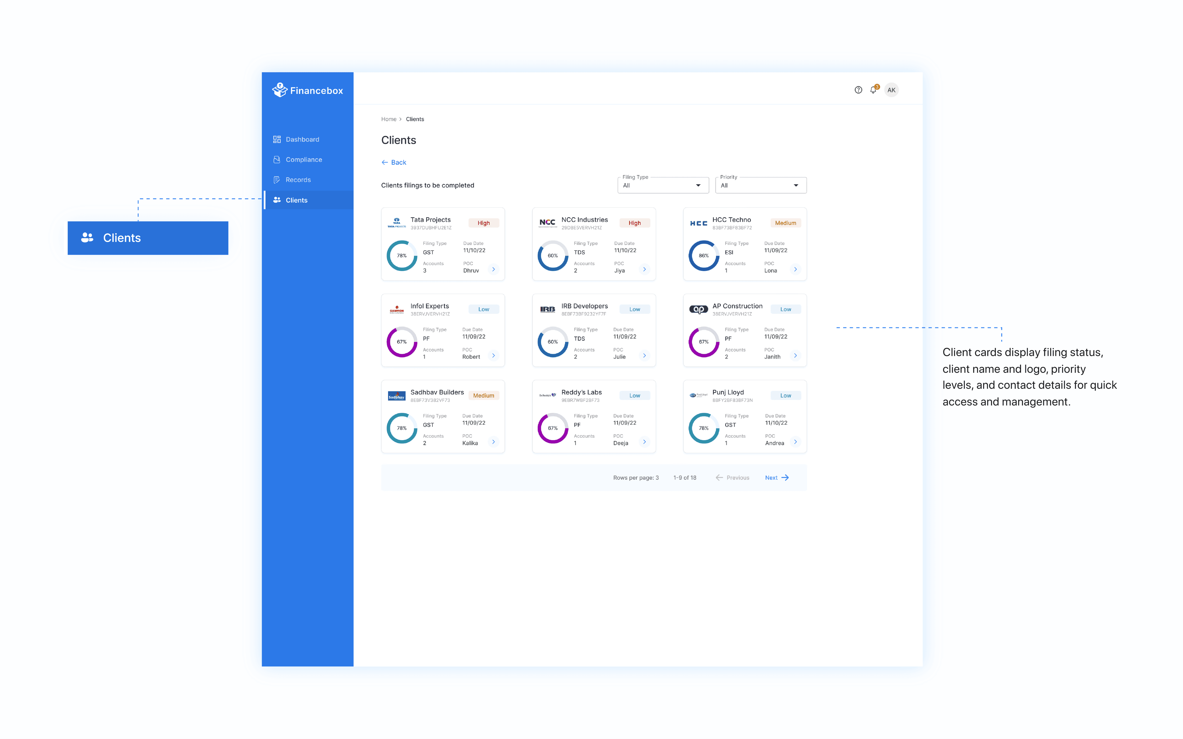
Every client at once
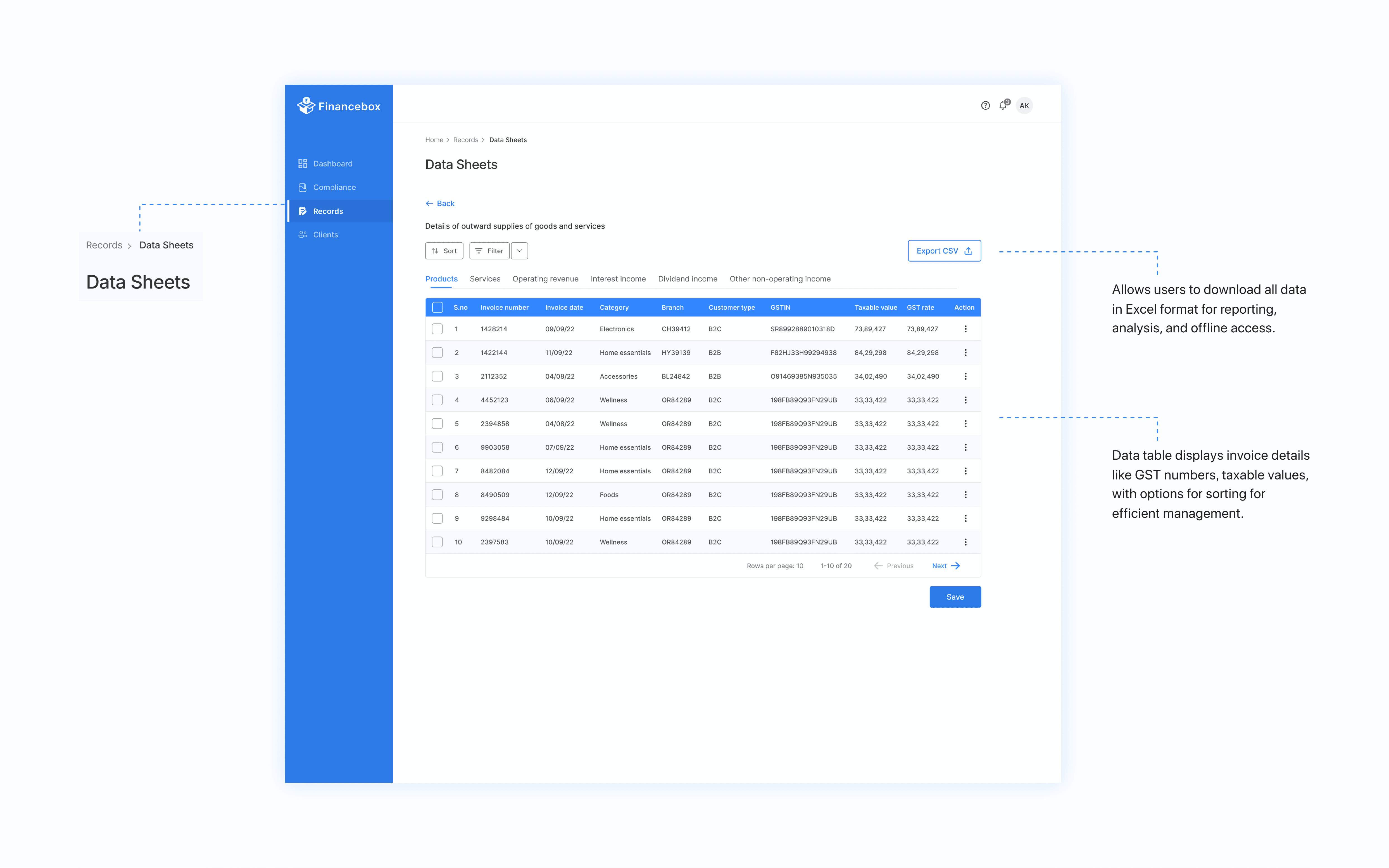
Dynamic columns, bulk edits and role-based access for people handling many clients.
Amend, then file
One continuous path instead of two places to travel between near a deadline.
Three surfaces that carry a filing week.
Every screen belongs to one of the four categories the accountants named.
Start with what’s due
Filing statuses, quick stats, upcoming deadlines, client assignments and shortcuts straight into the work, answering the first question of the day.
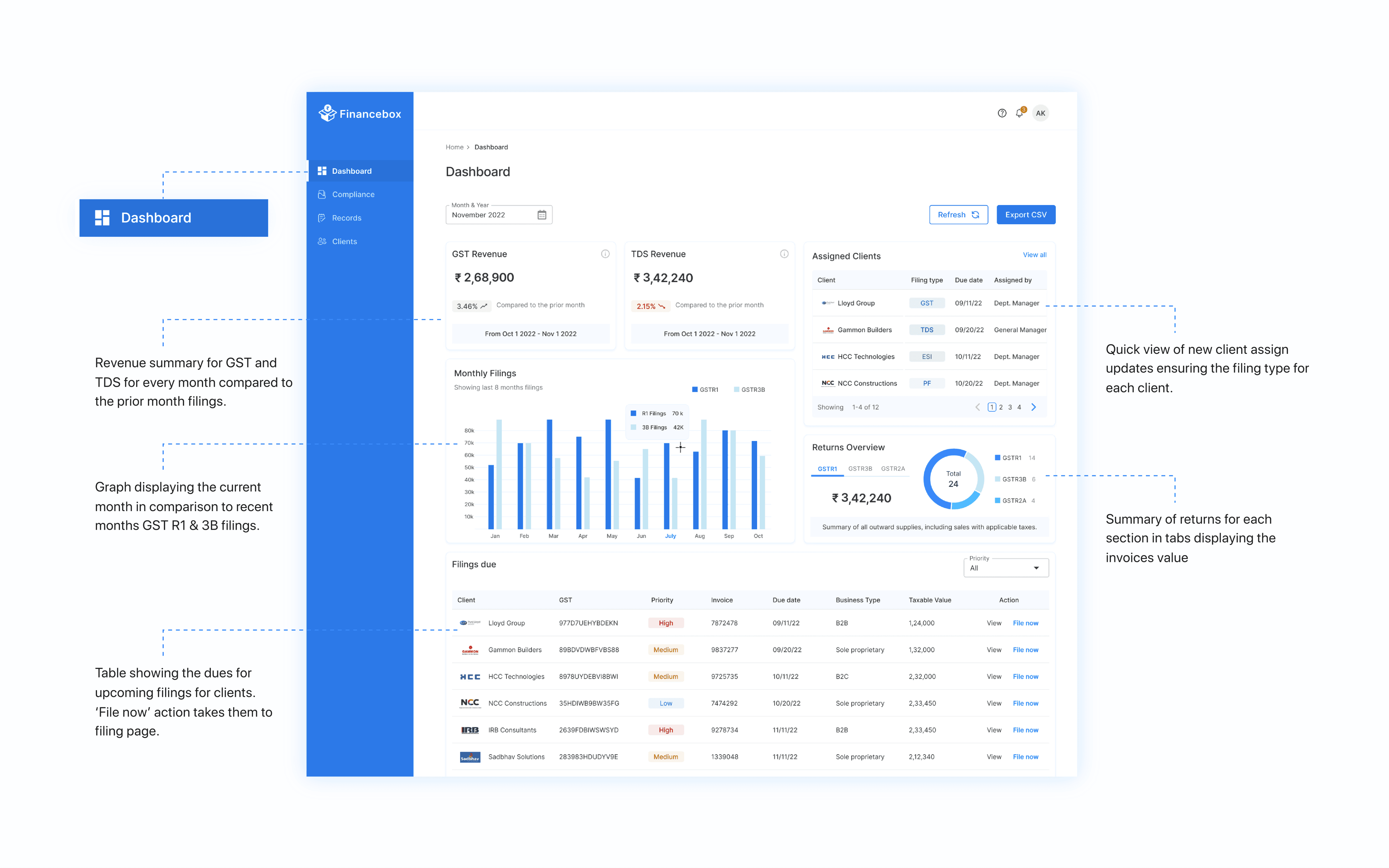
Correct the record, then file
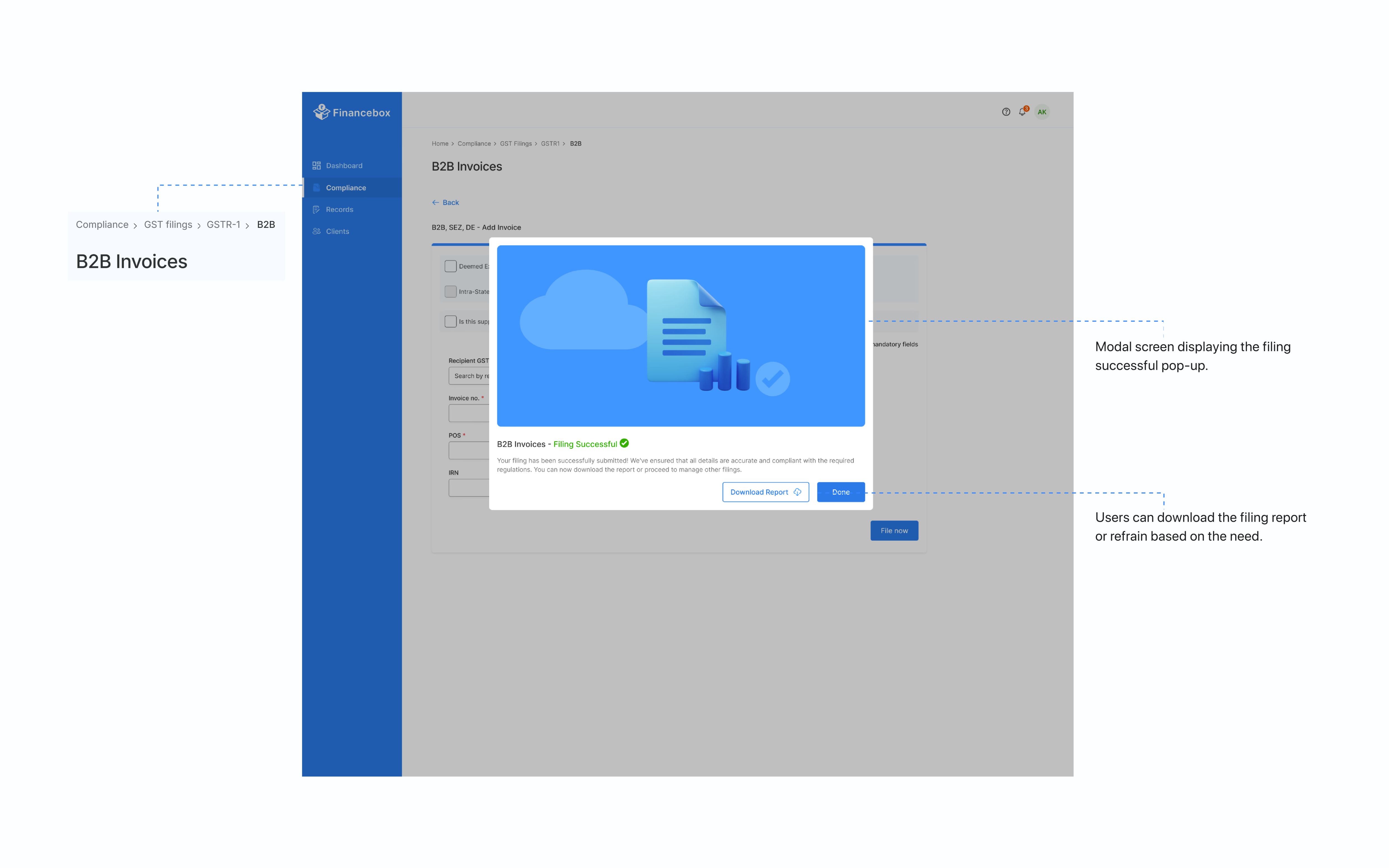
GST filing, record amendment and invoice management in the order the work happens: look, correct, file. Every seam removed is a place an accountant can’t lose their place.
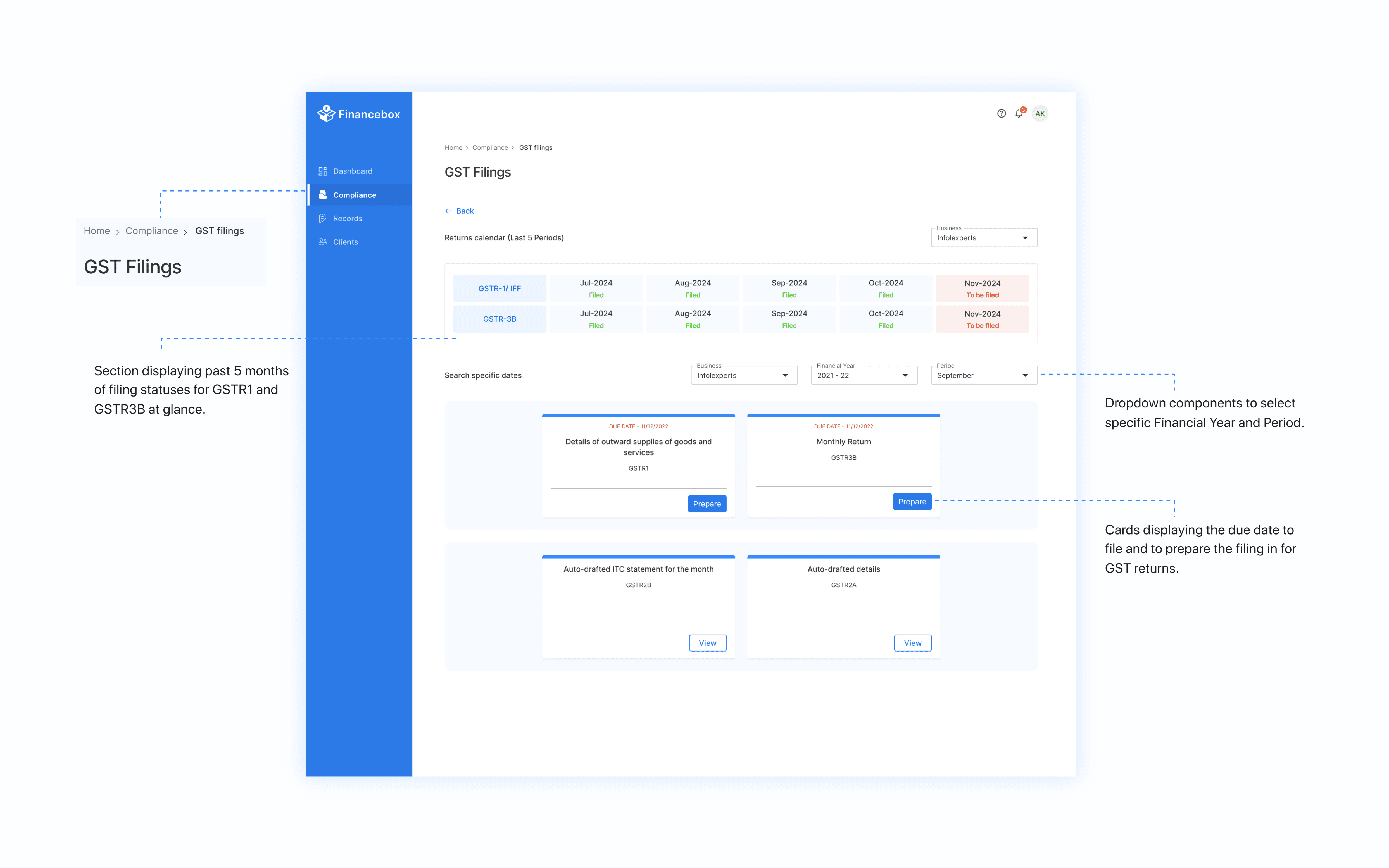
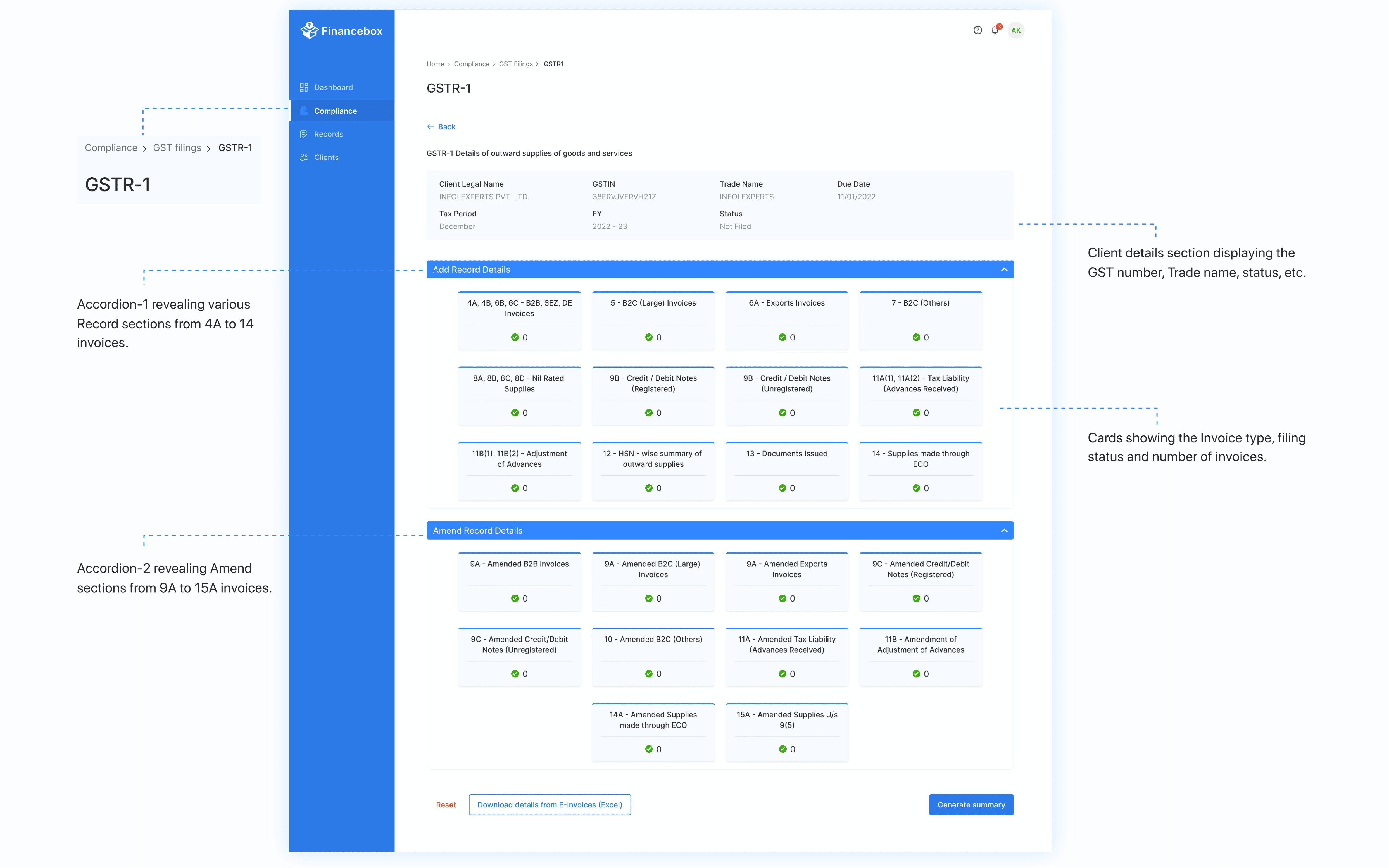
Keep every client’s file navigable
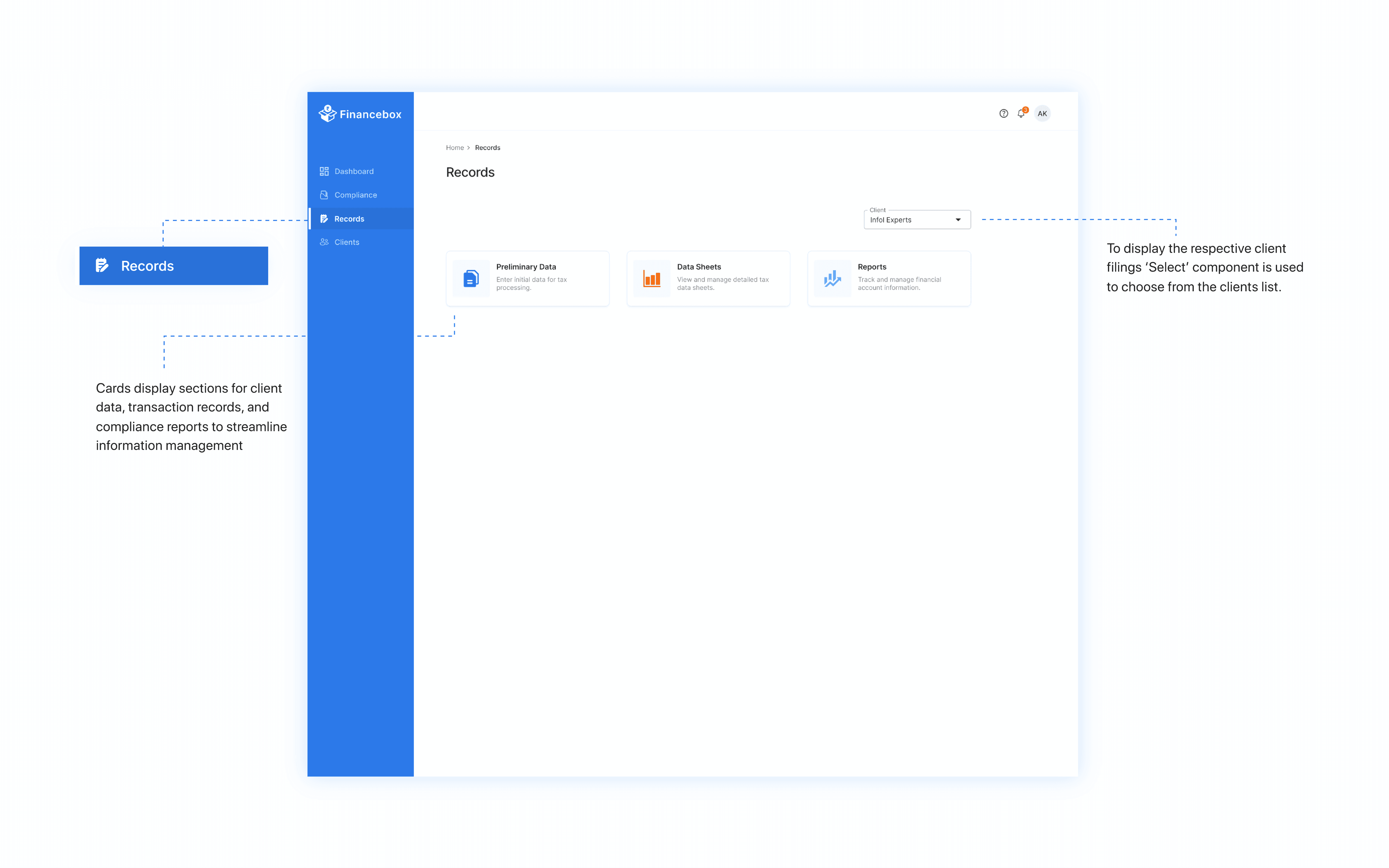
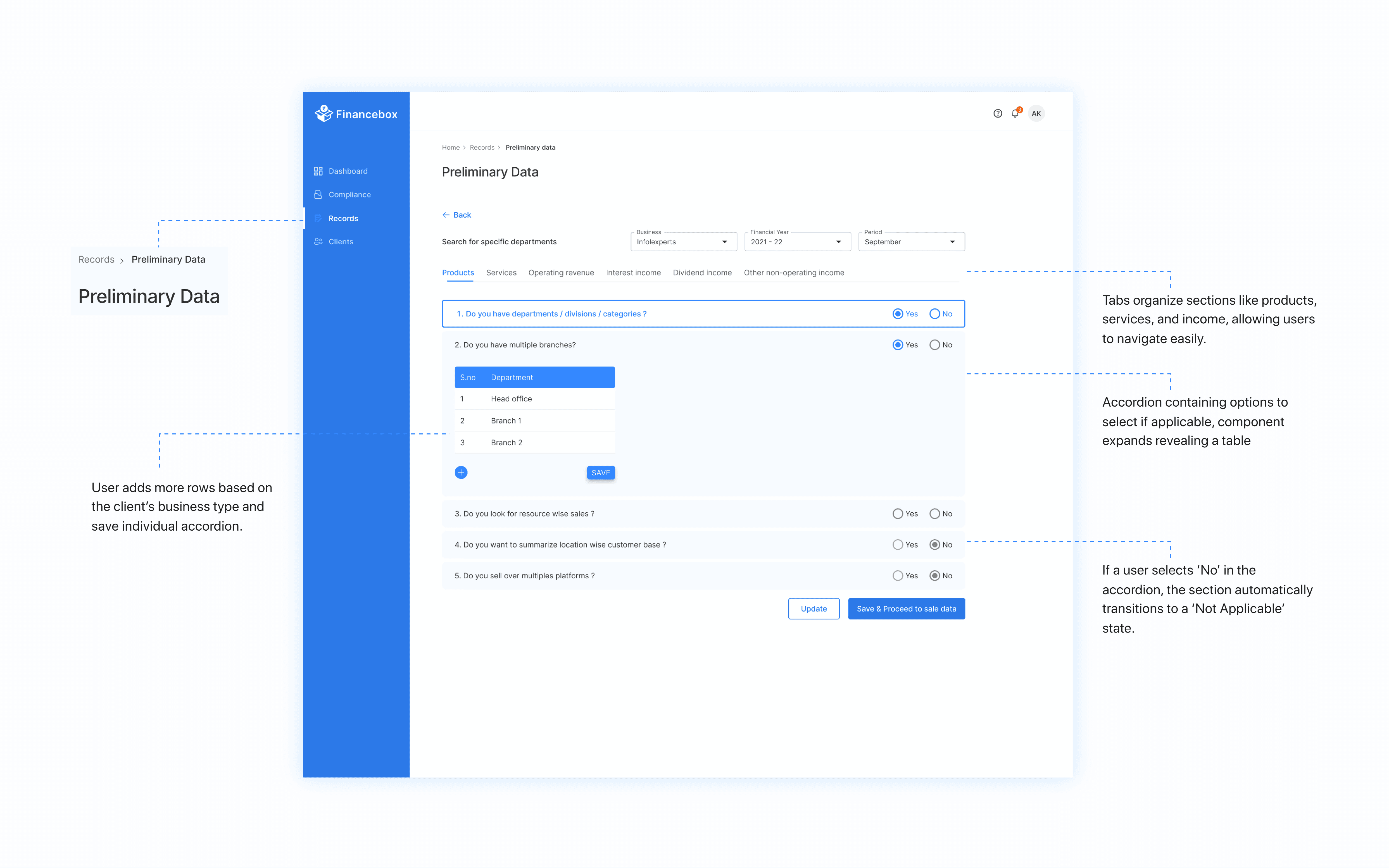
Business details, products, services and tax information in accordion panels, with the same structure for every client so switching never means re-learning.
Filing time down about 40%, and room to grow.
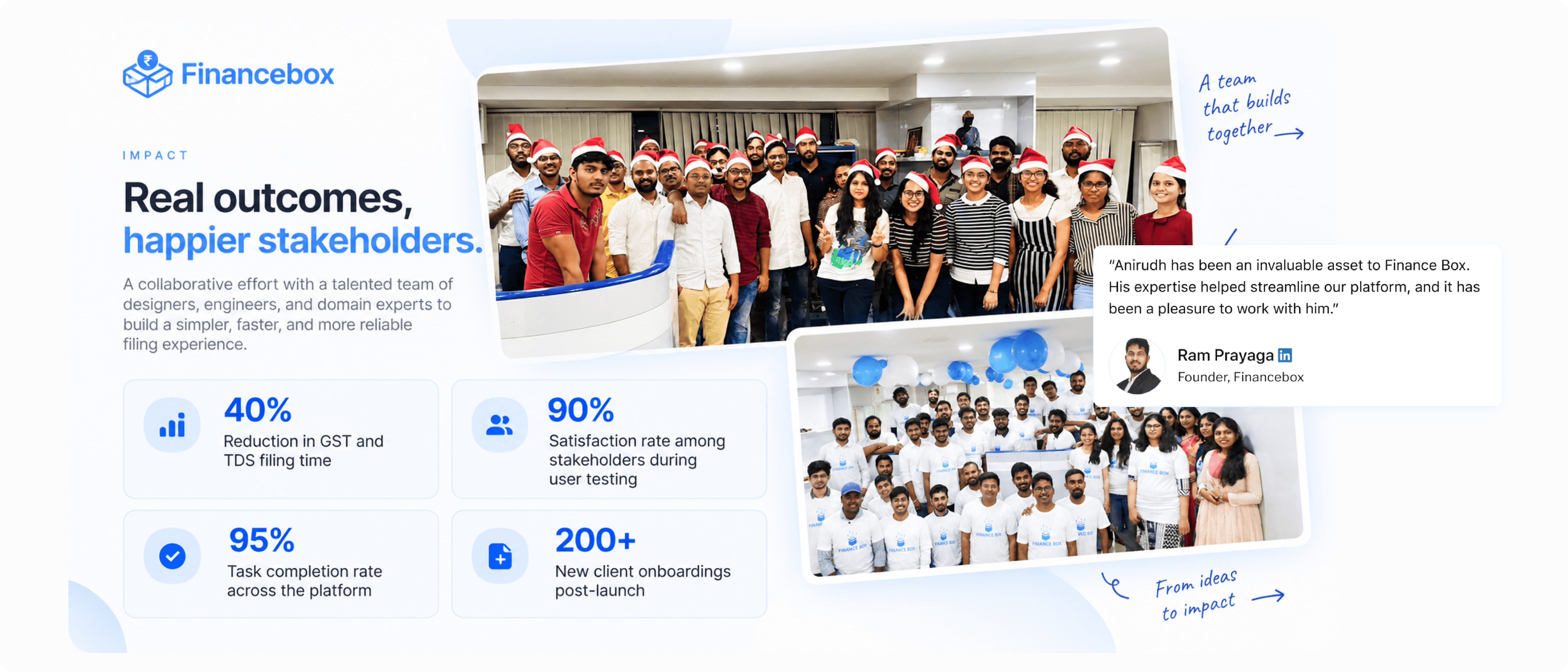
Financebox launched its own filing platform and measured the results afterwards. The change behind the onboarding figure matters most: the company could take on clients without the filing workload scaling at the same rate.
Reduction in GST and TDS filing time
Task completion rate across the platform at testing
Among stakeholders during user testing
New client onboardings after launch
Company-reported outcomes from a platform built by a team of eleven over eleven months. Design shaped the filing sequence, the architecture and the system; engineering, product and the accountants who tested with us shaped the rest.
- Before
- Filing at odd hours to dodge portal crashes
- After
- A platform of Financebox’s own, built around the deadline
- Before
- A dashboard showing file statuses and little else
- After
- Dues, client statuses and pending filings in one view
- Before
- Eighty pages to find the one that matters
- After
- One workflow, and the context around it
So, how did we get here?
From what shipped, to why it was designed this way.
I started with the people who pay the penalty.
Before drawing anything, I ran in-depth interviews with two groups: Financebox leadership, to pin down goals, scope and how success would be measured; and six chartered accountants who file for multiple clients, to understand what a filing week really looks like. The second group gave the project its shape.
Jahnavi, Accountant“A single dashboard for all my client’s statuses would save me hours.”
Charan, Assistant Manager“I manage multiple clients, but the portal doesn’t let me handle them in one go.”
Three insights that shaped the product
The portal has 80+ pages. Accountants use essentially one.
Competing on breadth would take years. Winning one workflow wouldn’t.
Accountants manage many clients, but see them one at a time.
Hours went into assembling a picture the software should have shown.
Downtime lands exactly when everyone files.
The risk wasn’t inconvenience, it was penalties and lost client trust.
Four questions that shaped the product.
Each started with more than one reasonable answer.
Replace eighty pages, or win the one that matters?
Sada, Manager“I mostly need just the returns page. But navigating so many pages is confusing and time-consuming.”
- Alternative
- Rebuild the portal’s breadth inside Financebox.
- Decision
- A better version of the one workflow, with the context the portal never gave anyone.
Who names the navigation?
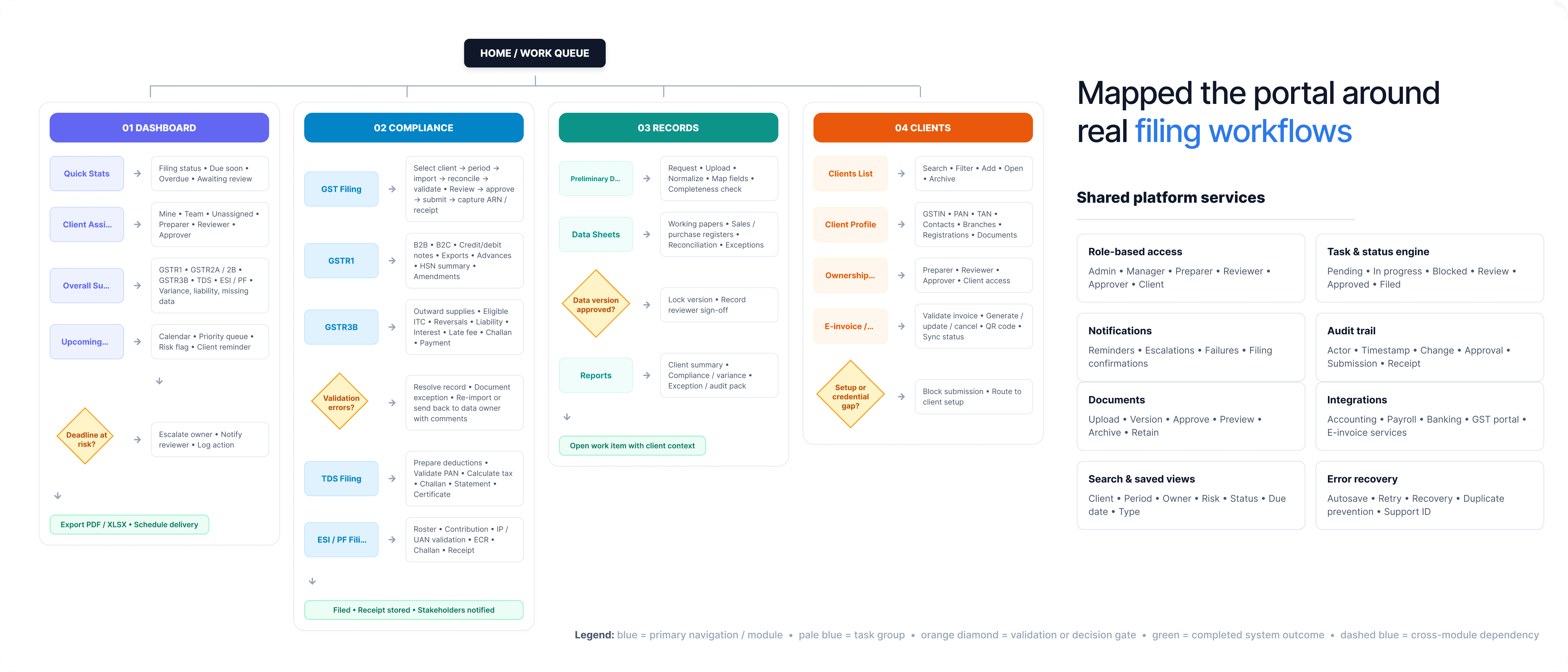
I could have written the information architecture myself, and it would have been wrong in ways I wouldn’t notice until testing. So I ran a card sort: participants grouped features and labelled each group in their own words. Those four words became the product’s spine. If something didn’t belong to one of them, it needed rethinking, not a new tab.
Compliance
Filing GST, TDS, ESI and PF. The core workspace.
Records
Preliminary data, data sheets and the reports filings depend on.
Dashboard
Statuses, client assignments, upcoming dues and summaries.
Clients
The master list, with details, tasks and progress.
Map the flows first, or start with screens?
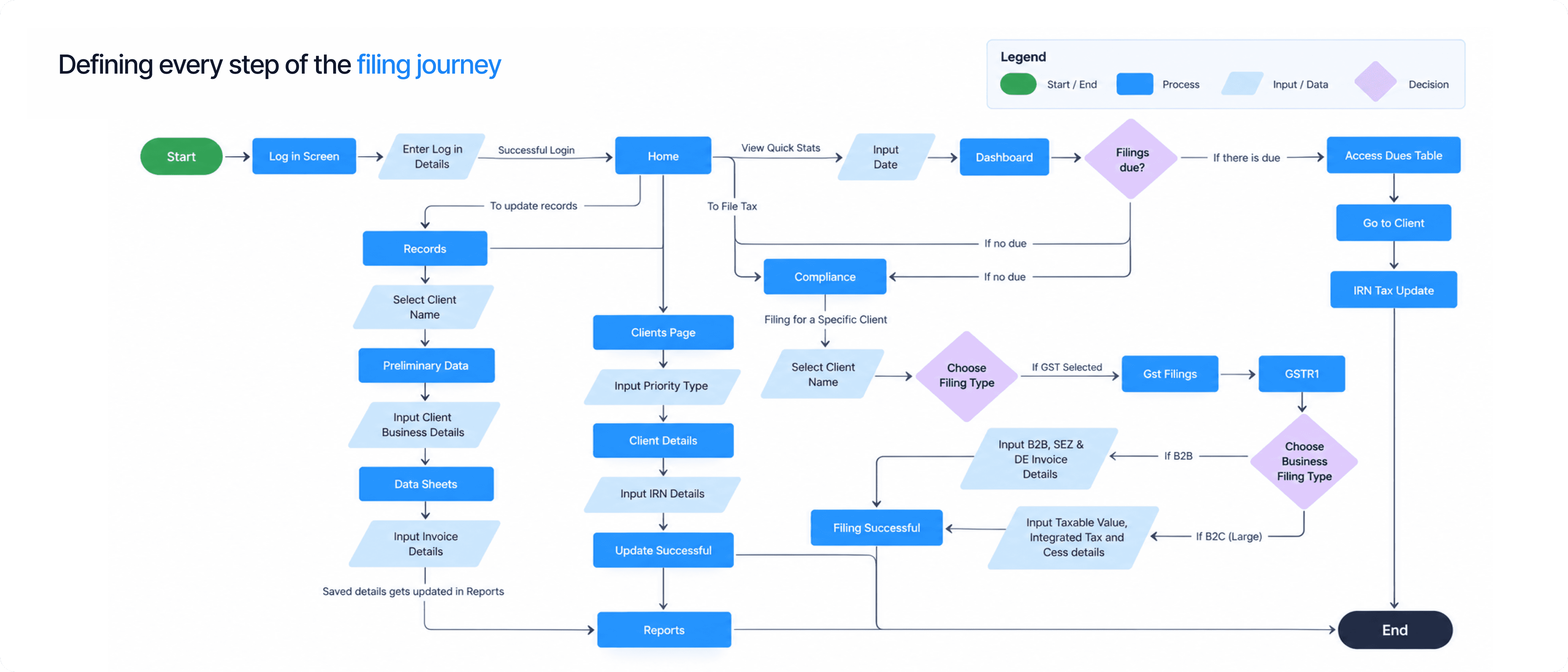
I mapped login through to a submitted return, including the branches where things go wrong, then drew deliberately ugly wireframes: dashboard quick stats, records in accordions, B2B and B2C invoices as cards, the compliance hub, and the amend-then-file sequence. I wanted to be wrong while it was still cheap.
A style guide, or a working system for one designer and eight engineers?
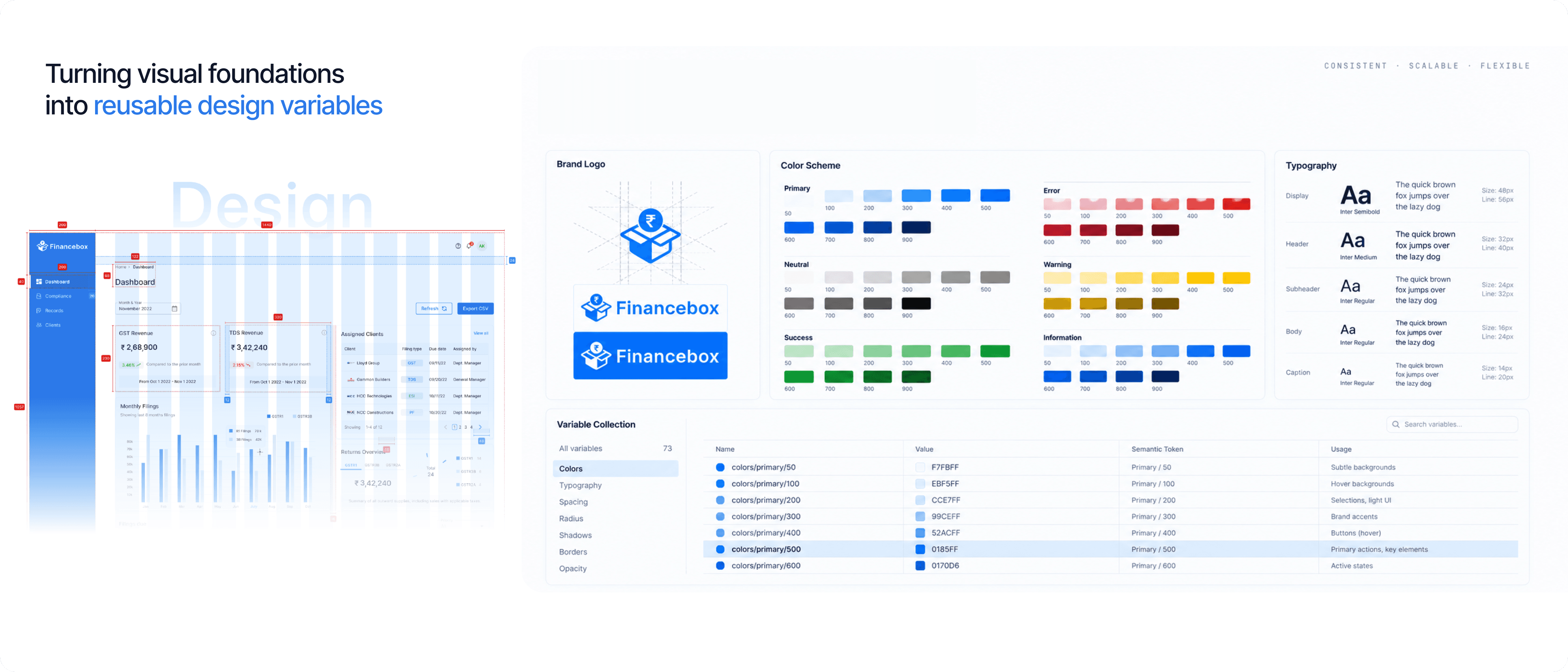
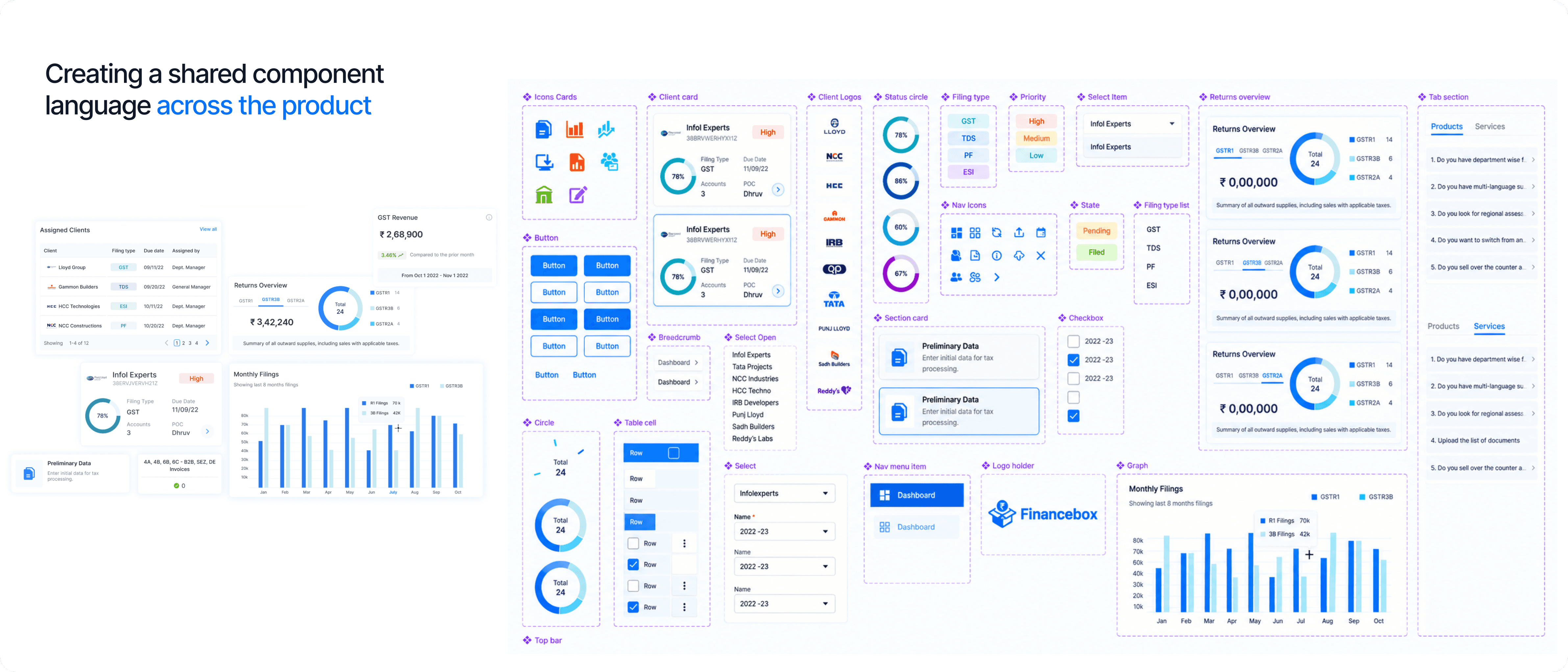
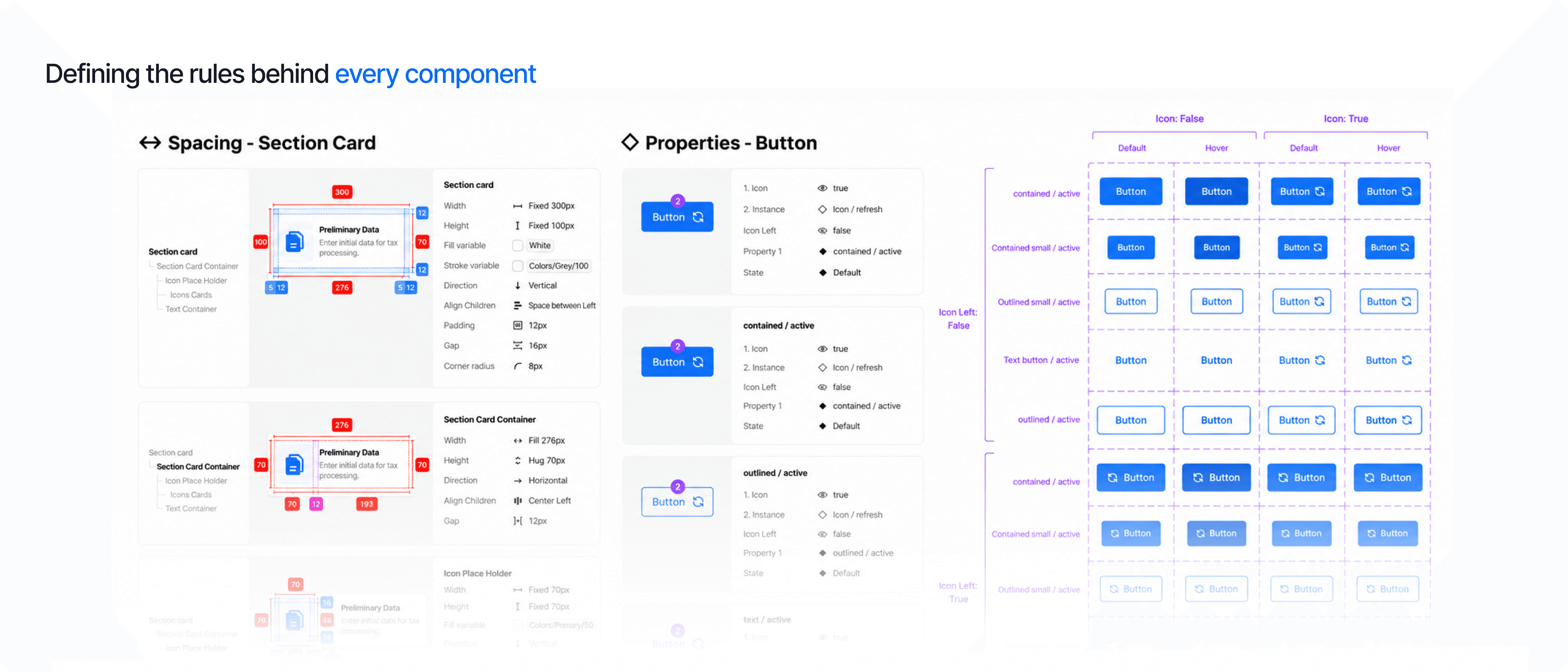
Every question that reached me personally had to wait for my timezone. So the visual identity went into a variable collection with semantic naming (the base value lives once; components ask for Colors/primary/500), a component library built for a compliance product, and documentation that answered questions when I wasn’t in the room.
Tested while it was still cheap to change.
People are generous when you ask them about an interface, and honest when you watch them use one. I tested twice, for two different reasons, then stayed close to implementation.
Concept testing
On wireframes, to check the four-category structure matched how accountants think before engineering time was spent.
Moderated usability
Remote sessions on real screens through Lookback.io, watching people file rather than describe filing.
Implementation support
Walking specs through with frontend and adjusting where a constraint made the original answer expensive.
- What changed
- The amend-then-file sequence tightened, and labels written for me were rewritten for them.
- Results
- 95% task completion across the platform, 90% satisfaction among stakeholders who tested.
The unglamorous half, done properly.
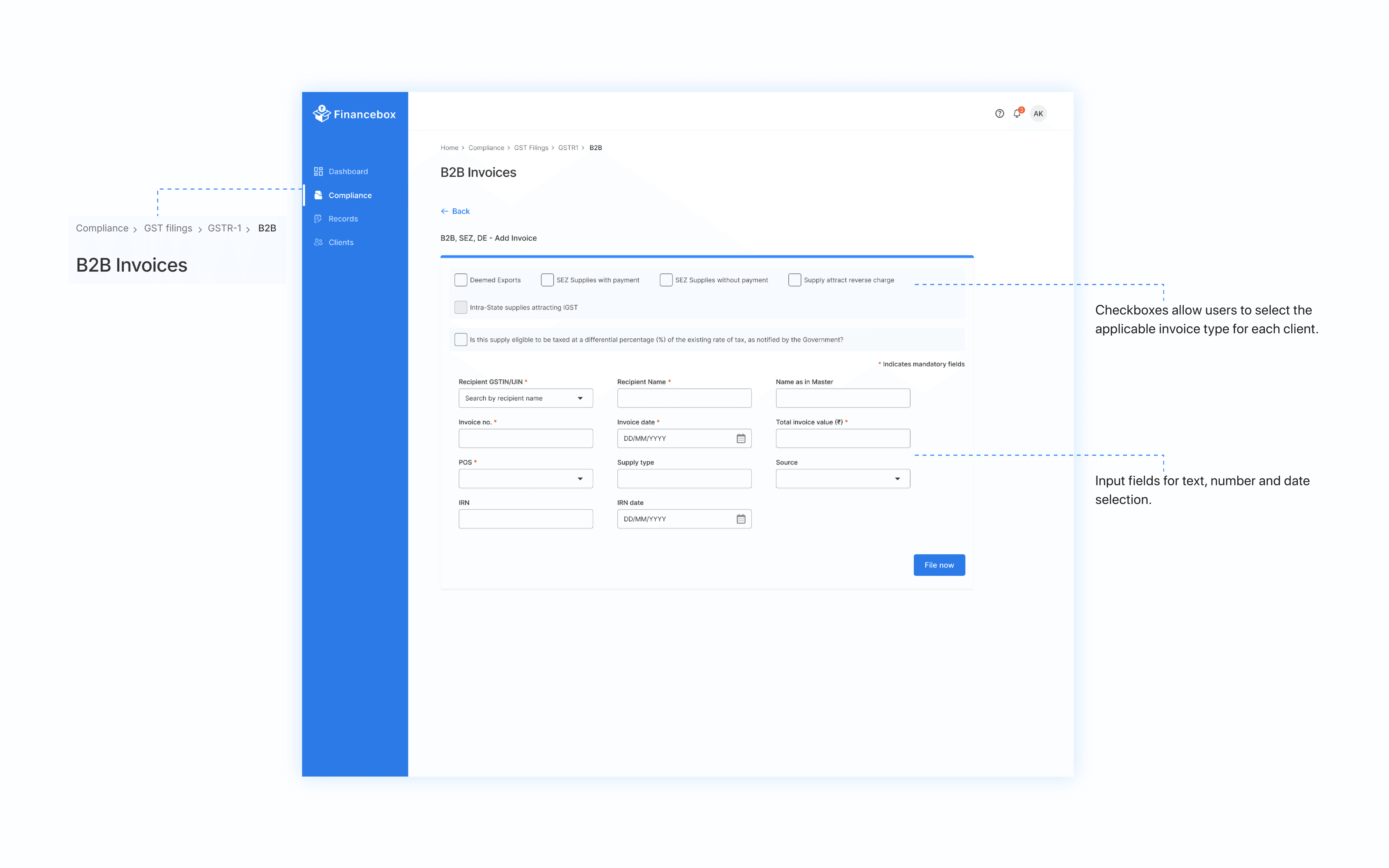
Records is where every filing’s data lives. Nobody puts this section in a portfolio, and every filing in the product depends on it being right.
- From feedback
- Progress indicators, preset filters and automated report scheduling
- New modules
- ESI, PF and further compliance, on the structure the card sort made room for
- Ongoing
- Monitoring behaviour and performance to decide what comes after
What I’d carry into the next zero-to-one
The most valuable hour of this project was the one where an accountant told me she only ever uses one page. Everything good about the product traces back to that sentence.
- 01
Ask before you build.
I’d have reached the same scope eventually by watching people struggle. Asking was faster, and it cost a conversation.
- 02
Let users name the structure.
The card sort produced categories I wouldn’t have drawn, and every screen afterwards had a home.
- 03
With one designer, the system is the multiplier.
It isn’t a luxury you build once there’s time. It is how one person keeps up with eight.
Accountants didn’t need a better tax portal. They needed one workflow, and everything around it to hold.
With thanks to Sada (Product Manager), Ruchita (Accountant) and Krishna (Frontend) at Financebox, who tested things, argued with me, and told me when I had it wrong.