I stopped trying to limit screen time and gave it a price.
Twelve parents told me the same thing in twelve different ways: the fight isn't really about hours, it's about having the same argument every single evening. So I designed a system where children buy their own screen time, and ran it in five real homes before designing a single screen.
Coinquest.

THE PROBLEM
Every evening, the same argument
In most homes with children, screen time is not a policy. It's a running negotiation that resets daily, and both sides are exhausted by it. Parents end up cast as enforcers of a rule they have to re-argue from scratch every time, and children experience the whole thing as something being taken away from them for reasons they had no part in.
I'd watched this up close, and what struck me was that nobody involved was enjoying the dynamic, including the parents doing the enforcing. I wanted to design something that didn't just regulate hours, but changed who was making the decision.
- ROLE
- UX research, gamification strategy, wireframing, UI, usability testing, solo
- CONTEXT
- Graduate thesis project, eight months, 2024
- METHODS
- Desk research, 1:1 interviews, affinity mapping, problem tree analysis, Wizard-of-Oz concept testing, usability testing
- TOOLS
- Figma, Otter.ai, DALL·E, Gifcap

DESK RESEARCH
What the published data said
I started where the evidence already was. Research on prolonged screen exposure in children reports that a majority become more lethargic and sedentary, over half prefer to stay alone, a similar proportion show more aggressive behaviour, and a substantial share see their academic performance suffer.
What the literature couldn't tell me was why the existing solutions weren't working. Every parent in this situation already knows screens are a problem. Knowing that hasn't helped them.
PRIMARY RESEARCH
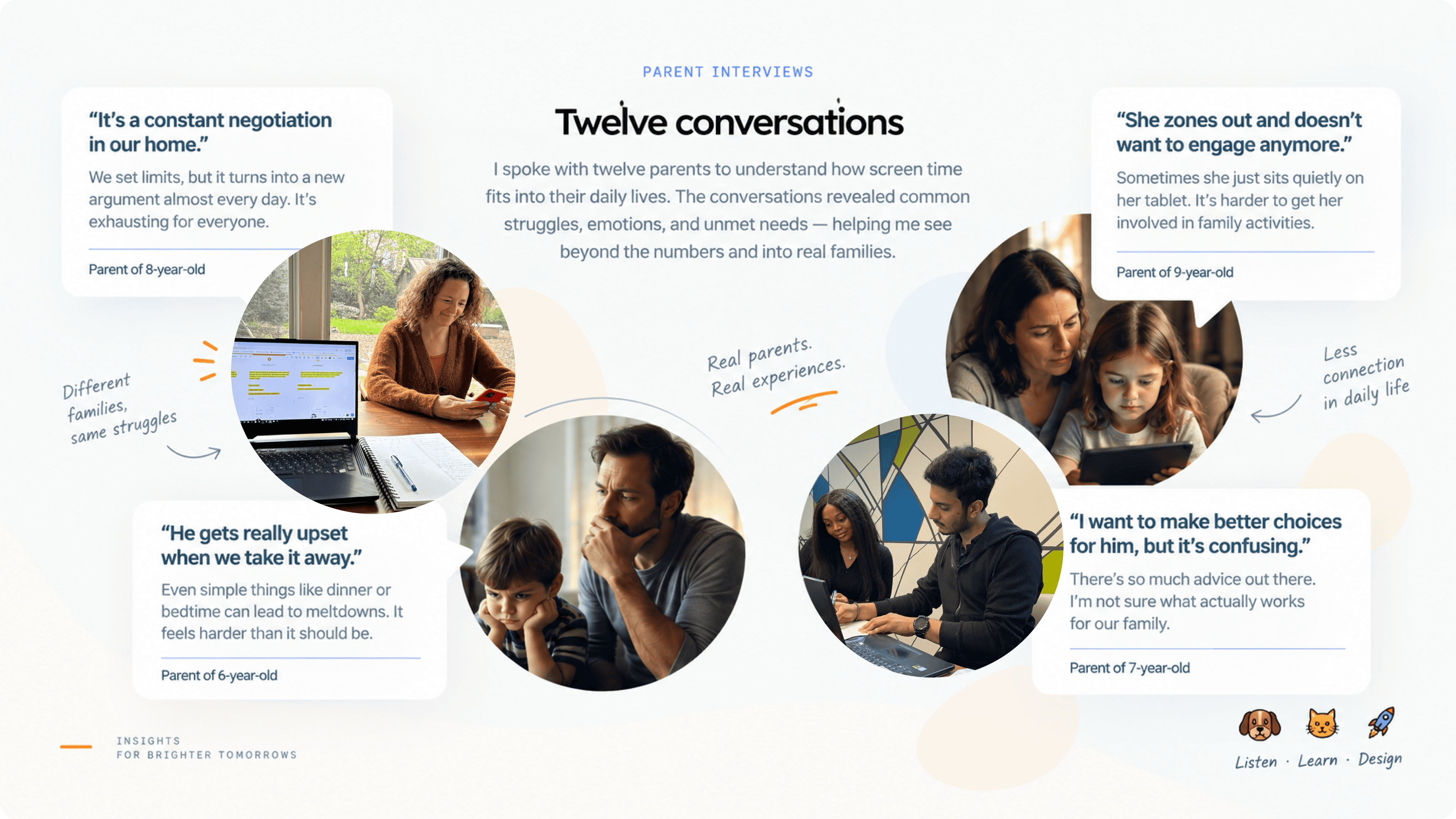
Twelve parents, and the thing they all said differently
So I recruited twelve parents of children aged five to twelve for one-to-one interviews, and asked them to walk me through how they actually manage screen time, not what they intend to do, what happens.
What came back wasn't a set of feature requests. It was a set of feelings.
She pouts her face, sits quietly, and refuses to talk. Always with the mobile - doesn't want to engage, even with my wife.PARENT, CHILD AGED 9
Resisting my kids' screen time adds emotional complexity to my efforts. Navigating the impact on their behaviour is a real challenge.PARENT, TWO CHILDREN
I often find it hard to convince my child over screen time, and he always ends up very frustrated. This stresses me more.PARENT, CHILD AGED 7
I synthesised these through affinity mapping and a problem tree analysis, which surfaced ten root causes - balancing time, developmental concerns, work-life demands, guilt about content, the screen-centric culture the children live inside. But almost every branch traced back to the same trunk: the negotiation never ends, and the parent is always the one holding the line.

THE REFRAME
The paradox that changed the project
Then one finding rearranged everything. Around 40% of the parents I spoke to felt their children were using screens passively, consuming, not engaging, not making anything, not choosing anything.
That reframed the problem for me. The issue was never purely the quantity of screen time. It was that screen time had no cost attached to it and no decision inside it. A child given two hours and a child given four hours are doing the same thing: receiving an allocation somebody else set, passively, with no stake in it.
The fight wasn't about hours. It was that screen time was free, so there was nothing for the child to decide, and nothing for them to own.THE INSIGHT THE PRODUCT IS BUILT ON
Which turned the design question into something much more interesting than how do we limit this. It became: what if screen time were something you had to choose to spend?

THE IDEA
Children already understand trade
A thread running through the interviews was that children respond well to systems of trade and reward. They already understand earning something and spending it; that logic is intuitive long before anyone explains economics to them.
So there were two paths in front of me. Path A, build a better version of the traditional screen-time limiter, which is what every existing product does. Path B, build a currency. Children earn coins for chores and responsible behaviour, and spend them on screen time at a fixed, visible rate: one coin, sixty minutes.
Path B moves the decision from the parent to the child without removing the parent's control, because the parent still sets how many coins exist. The child isn't being told no. The child is being asked whether this is what they want to spend on.
VALIDATION
I tested it in five homes before I designed a screen
A coin-based model is either obvious in practice or it collapses the first time a real seven-year-old encounters it, and no amount of wireframing tells you which. So before I opened Figma, I ran the concept manually in five families for a week, physical coins, parents setting the allocation, children spending them, no software at all.
Two techniques did the work. A Wizard-of-Oz setup, where the parent performed the role the app would later play, issuing coins, approving the exchange. So I could watch the interaction before building the machinery behind it. And a Pinocchio prototype: a non-functional stand-in for the coin, so children were handling something real without me having built anything.
What came back after seven days:
- Three of five parents
- set a daily screen-time limit for everyone in the household, not only the children, which I hadn't anticipated and which changed how I thought about family profiles.
- Four of five children
- successfully spent coins to buy screen time from the balance they held.
- Four of five parents
- reported lower screen-time usage over the week.
Small numbers, and I'll say so plainly, five households is a signal, not a proof. But it was enough to tell me the core exchange was legible to children without an adult translating it, which was the one thing that had to be true before any of the rest was worth designing. And the parents' own reports of increased accountability were consistent enough to be worth taking seriously.

LANDSCAPE
Nobody was doing this
A competitive analysis across Qustodio, OurPact, Forest and Calm confirmed what the interviews had implied. There are good products for restricting screen time, blocking apps, and building focus habits for adults. There was no product where a child spent something to get screen time. The whole category was built around restriction, and restriction is precisely the thing the parents I spoke to were tired of administering.

DESIGN
Three bridges
I reduced everything the research had produced into three problems the product had to solve. They became the spine, every screen had to serve one of them, and anything that didn't got cut.
- Empower parents
- with screen-time management that takes effort away rather than adding it.
- Encourage children
- to develop responsible habits by giving them something to own.
- Create positive interaction
- between the two, instead of another enforcement surface.
I started with a storyboard rather than screens, a scene of a parent using CoinQuest at home, and then low-fidelity wireframes, with the flow deliberately split into two paths from the beginning. A parent's journey and a child's journey, meeting at exactly two points: the allocation, and the prompt.


A picnic, not a dashboard
Parental-control software mostly looks like surveillance software, which is a fair description of what it does and a terrible fit for a product meant to bring a family closer together.
So the visual direction went the other way: a nature and picnic palette, warm rather than clinical, something a family could recognise itself in. The golden hue is reserved for the coins, because the coin is the thing that carries value and it should read as valuable. The logo is built around the idea of a quest, a journey toward responsible use, rather than a lock on a door.

The parent's side: set the budget once
The parent flow is built around removing a recurring decision rather than adding a new dashboard to check. Parents avail virtual coins, create a profile for each family member, and allocate the week's coins at the start of it. That's the work. Everything after is optional: analytics on how time was actually spent, which apps consumed it, and the weekly leaderboard.
The thing I'd defend here is the weekly cadence. A daily allocation just recreates the daily negotiation in software. Setting the week's budget once is what converts an argument into an agreement.
The child's side: the first real choice
When a child opens a managed app, they meet a prompt: here's your balance, here's what this will cost, do you want to spend it? They can spend, or go back. A coin animation makes the transaction feel like something happened, because to a child it should, a balance silently decrementing teaches nothing.
That prompt is the emotional centre of the product. It is the first moment in this entire dynamic where the child is the one deciding, and it reframes the whole relationship without removing any parental control: the parent still determines how many coins exist.
Spending on educational content earns points toward the leaderboard, which is where the system quietly makes its argument, not all screen time is the same, and the child gets to discover that through their own spending rather than being told.
TESTING
What the numbers say, and what they don't
I tested the prototype with five participants across thirty tasks and more than 200 minutes of sessions, asking each person to rate ease and confidence per task from zero to five, and scoring completion myself.
- 100%
- Ease score across all tasks
- 91%
- Confidence score
- 100%
- Task completion
- 5 / 30 / 200+
- Participants, tasks, minutes of testing
The more useful result sits in the week-long home test earlier: children understood the exchange without an adult explaining it, and parents reported less screen time. That's behaviour in a real environment, which is worth more than a task-completion rate in a session.

REFLECTION
What CoinQuest taught me
The thing I keep coming back to is that control and autonomy are not opposites. I started this assuming the design problem was finding a fair point on a slider between parental control and child freedom. It isn't a slider. The parent kept full control over how many coins exist, and the child gained complete autonomy over how to spend them, and both sides ended up with more than they had under a straightforward time limit.
The second thing is about where the design work actually happened. The product's best idea isn't an interface decision at all; it's an exchange rate. One coin, sixty minutes, and once that was right, the screens were comparatively easy. If I'd started in Figma I would have designed a very polished version of the wrong product.
And the third: the week in five kitchens told me more than any amount of wireframe review would have. Testing a concept before an interface exists is cheap, slightly awkward to arrange, and the highest-value hour in the whole project.
Nobody wants to be the person who says no every evening.
So I made it a question the child gets to answer.
CoinQuest · graduate thesis, 2024. With thanks to the twelve parents who talked to me candidly about something difficult, and the five families who ran a stranger's idea in their homes for a week.